
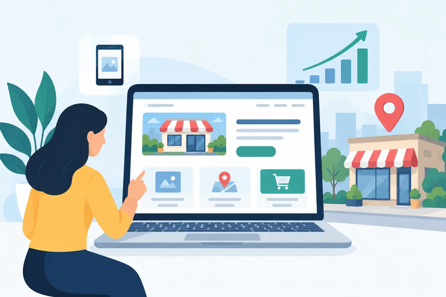
A website does not get a second chance to explain a confusing offer. When a homeowner, guest, tenant, or local customer lands on your page, they are usually asking three quick questions: What do you do? Can I trust you? What should I do next? The most useful web design trends answer those questions faster, rather than adding visual noise for the sake of looking current.
For small and mid-sized businesses, trend-led design should still serve a practical job: build credibility, make information easy to find, and turn attention into calls, bookings, quote requests, or visits. That means choosing modern ideas with a clear purpose, not rebuilding a site every time a new effect appears on a design feed.
Web Design Trends That Earn Their Place
Clearer page hierarchy
The strongest shift in web design is toward clarity. Homepages are becoming less crowded, with a direct value statement, a short explanation of the service, proof that the business is credible, and one obvious next action. This is not a minimalist look for its own sake. It is a response to how people browse: quickly, often on a phone, and with limited patience for vague language.
A local roofing company, for example, should not lead with a large abstract image and a slogan that could apply to anyone. It should state the service area, the work it does, and how to request an estimate. A hotel or hospitality venue should make availability, location, key amenities, and booking paths visible without forcing visitors to hunt through the menu.
Good hierarchy uses size, spacing, contrast, and order to guide the eye. It also means resisting the urge to give every message equal weight. Your primary service and primary call to action should lead. Secondary offers can support the decision later on the page.
Strong typography with a real job to do
Oversized type, expressive typefaces, and more confident use of headlines continue to shape modern websites. Used well, typography gives a smaller business a sharper, more established presence. Used poorly, it can make a site difficult to scan or impossible to read on smaller screens.
The practical approach is to choose type that reflects your brand personality while keeping body copy plain and legible. A boutique hospitality brand may use an editorial-style display font for section headings. A trades business may need a bold, straightforward system that communicates reliability. In both cases, customers should be able to understand the page at a glance.
Typography also carries brand consistency beyond the website. When the same visual choices appear in business cards, flyers, signage, proposals, and social assets, customers recognize the business more quickly. That recognition matters when someone sees your flyer today and searches for you next week.
Original photography over generic visual filler
Stock photography still has a place, especially when a business is new or needs a specific scene that cannot be photographed easily. But original imagery is increasingly one of the clearest ways to create trust. Customers want to see your team, your premises, your work, your products, and the people behind the service.
For property operators, this means current, well-composed images that show the actual spaces customers will encounter. For service businesses, it can mean photos of staff at work, completed projects, vehicles, equipment, or local locations. The goal is not to create a glossy magazine spread. The goal is to remove uncertainty.
Professional photography works best when planned around the website structure. Before a shoot, decide which pages need a hero image, which services need supporting visuals, and where proof points such as team portraits or project details will sit. That prevents a common problem: paying for good images, then having no clear place to use them.
Motion with restraint
Subtle movement can help direct attention. A short product animation, a before-and-after image treatment, or a gentle transition between sections can make a site feel polished and intentional. Motion can also explain something that static content struggles to show, such as a service process or physical space.
There is a trade-off. Heavy animation can slow a site down, distract from the message, and frustrate users who just want a phone number or booking form. It can also create accessibility issues for visitors sensitive to movement. The best rule is simple: if the motion does not clarify, guide, or demonstrate something, leave it out.
Intentional color and contrast
Many current websites use bolder color blocks, warmer neutrals, layered textures, and more deliberate contrast. This can make a brand feel more distinctive than the familiar white page with a generic blue button. However, visual personality must not come at the cost of usability.
Every critical action should be easy to see. Text needs enough contrast against its background. Buttons should look clickable. Forms should not make visitors guess what is required. A brand palette may look excellent on a printed flyer but need adjustment on screen, where lighting, device settings, and screen sizes vary.
A disciplined color system helps keep marketing consistent. Define primary colors, supporting colors, button states, background options, and accessible text combinations before expanding the website. That gives your team and future suppliers a practical standard to work from.
Web Design Trends Are Becoming More Human
Artificial intelligence is changing how businesses create content, visuals, and basic website components. It can speed up early research, help organize page ideas, and reduce repetitive production work. But it cannot replace local knowledge, a clear offer, or honest proof that your business delivers.
This is why the more valuable trend is not simply AI-generated design. It is human specificity. Customers respond to a site that understands their situation: a property manager needing fast maintenance support, a family comparing local venues, or a business owner looking for a dependable supplier. Specific service pages, real project examples, useful FAQs, and plain-language explanations will outperform polished but generic content.
Personalization can help when it is handled carefully. A page that changes a service area reference or highlights a relevant offering may improve relevance. Yet overdone personalization can feel intrusive, particularly when visitors do not understand why a website appears to know so much about them. Keep it transparent and useful.
Mobile-First Is Still the Business Standard
Mobile-first design is not a trend that will pass. It is a business requirement. Many local searches happen when people are away from a desk, comparing options between errands, standing outside a venue, or responding to an immediate problem.
A mobile-ready site needs more than a layout that shrinks. Tap targets should be large enough to use comfortably. Key contact options should be visible. Forms should ask only for information you genuinely need at the first step. Images should load efficiently, and important text should not be buried inside graphics that become unreadable on a phone.
Test your own customer journey regularly. Search for your service, open your site on a phone, and try to complete the main action. Request a quote. Call the office. Find opening hours. Book an appointment. If any step takes more thought than it should, that is a stronger priority than the latest visual trend.
Which Web Design Trends Should You Skip?
Skip any feature that makes the site slower, harder to read, or less direct. Full-screen videos that delay the page, unusual navigation that hides basic information, tiny low-contrast text, and pop-ups that appear before visitors understand the offer are common examples. They may look impressive in a presentation, but they often create friction in real use.
You should also be cautious with designs that imitate a competitor too closely. A visual style can be popular because it fits a particular industry or audience, but your business still needs a recognizable point of view. The right website should look connected to your brand materials, your customer experience, and the quality level you want to represent.
A Practical Way to Apply New Ideas
Start with the business outcome, not the visual feature. If you need more qualified inquiries, prioritize service clarity, proof, and a simple inquiry path. If you need to support ongoing promotions, build flexible page sections and campaign landing pages that can be updated without rebuilding the entire site. If your brand feels inconsistent, establish the identity system first, then apply it across web and print.
A structured process keeps this work controlled. Define the pages and actions that matter most, gather the photos and proof points needed, create the design direction, review it against real customer tasks, and then build. Clear checkpoints make it easier to move quickly without making expensive decisions based on taste alone.
The best website will not be the one that uses every current idea. It will be the one that makes your business easier to understand and easier to choose. Begin with the page your customers need most, make one meaningful improvement, and let real customer behavior guide the next decision.