
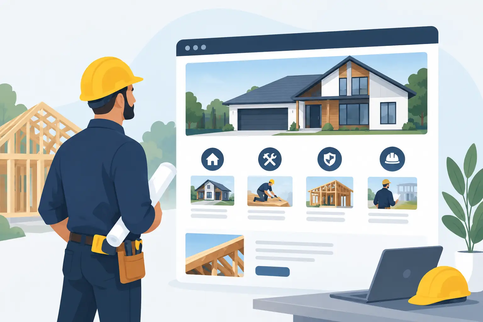
A contractor’s website has a short window to answer the questions that decide whether a prospect calls: Do you do this kind of work? Do you serve my area? Can I trust you in my home or on my site? The best homepage sections contractors use are not decorative extras. They create a clear path from first impression to qualified inquiry.
For local trades and construction businesses, a homepage should work like a well-organized site visit. It should establish the scope, show evidence, set expectations, and make the next step easy. The goal is not to say everything. It is to help the right customer act with confidence.
Start With a Clear Above-the-Fold Offer
The first screen needs to state what you do, who you help, and where you work. “Quality workmanship” is not enough on its own. Every contractor says it. A homeowner looking for a kitchen remodel, roofing repair, commercial fit-out, or concrete work needs immediate confirmation that they are in the right place.
Use a direct headline built around your primary service and market. For example: “Custom Bathroom Renovations for Homeowners in Austin” or “Commercial Electrical Work for Dallas Property Managers.” Support it with a short sentence that explains the result you deliver, such as dependable scheduling, clean project management, or long-lasting materials.
Place one primary call to action beside that message. “Request an Estimate,” “Book a Site Visit,” or “Call for Emergency Service” gives people a clear next move. If calls are central to your sales process, show the phone number prominently. If quoting requires job details, lead with a short estimate form instead.
The image matters just as much as the copy. Use a strong photo of completed work, your team on site, or a recognizable local project. Avoid generic stock images of hard hats and handshakes. They make a capable business look interchangeable.
The Best Homepage Sections Contractors Should Prioritize
Not every business needs a long homepage. A residential painter with a focused service area needs less explanation than a general contractor handling large renovations. Still, most effective contractor sites need the same core proof points, arranged in an order that reduces hesitation.
Services That Make Scope Obvious
List the services you want more of, using customer language rather than internal trade jargon. “Roof replacement,” “storm damage repair,” and “gutter installation” are clearer than a broad label such as “exterior solutions.” Each service should include a brief description of the type of customer or project it suits.
This section also helps filter poor-fit inquiries. If you only take full remodels, say so. If you handle commercial projects but not residential repairs, make that visible. Clear scope saves your team time and makes your pipeline more qualified.
A service section works best when it is concise on the homepage, then supported by dedicated service pages for businesses that need to rank across several offerings. The homepage should guide visitors, not bury them in technical detail.
Service Areas That Prove You Are Local
Contracting is local, and customers want to know whether you will actually take their job. Include your primary city, nearby suburbs, and the region you serve. A simple service-area section can remove one of the biggest barriers to inquiry.
Be specific without turning the page into a repetitive list of place names. A short statement like “Serving homeowners and property managers across Phoenix, Scottsdale, Tempe, and the East Valley” feels practical and credible. If travel fees, minimum project sizes, or different coverage areas apply, explain that before the contact stage where appropriate.
Project Proof, Not Just Pretty Photos
A gallery is useful, but a portfolio section should do more than show finished rooms or clean job sites. Pair selected images with enough context to demonstrate problem-solving. What was the project? What was the constraint? What changed?
A remodeling contractor might show a dated kitchen beside the completed space and mention that the project involved a reconfigured layout, custom storage, and a defined completion schedule. A commercial contractor might highlight tenant improvement work completed around operating hours. These details help prospects see how you work, not only what the final result looks like.
Use professional photography whenever possible. Strong images support every part of the brand: the homepage, proposals, social posts, flyers, and sales materials. They also give your business a level of credibility that phone snapshots rarely achieve.
Reviews, Credentials, and Trust Signals
Most visitors will look for evidence before they contact a contractor. Include real customer reviews with names or initials, locations when permitted, and the type of work completed. Short, specific testimonials carry more weight than vague praise.
Credentials belong here too: licensing, insurance, certifications, supplier partnerships, safety training, warranties, and years in business. Do not place a wall of badges on the page and assume it creates trust. Choose the credentials that matter to your buyer, then explain their value in plain language.
For example, “Licensed and insured for residential and light commercial projects” answers a real concern. “Five-year workmanship warranty” gives a prospect a concrete reason to feel safer choosing you.
A Simple Process That Sets Expectations
Many customers delay contacting a contractor because they expect a confusing, high-pressure process. A short process section lowers that friction. It shows them what happens after they submit a form or make a call.
A three-step structure is usually enough: share your project, receive a site visit or consultation, then review a clear scope and estimate. If your team uses fixed milestones, scheduled updates, or defined revision rounds for design work, state that. Process is part of the product, especially for higher-value renovation and commercial jobs.
The strongest contractor websites make practical promises they can keep. If estimates are normally sent within a certain timeframe, say so. If a consultation requires a booking deposit, explain it upfront. Clarity is more persuasive than broad claims about great service.
Give Each Call to Action a Job
A common homepage mistake is using the same generic “Contact Us” button everywhere. A visitor near the top of the page may only be ready to ask a question. Someone who has reviewed your services, work, and testimonials may be ready to request an estimate.
Use calls to action that match the moment. Early buttons can invite visitors to view services or see recent projects. Mid-page calls can encourage a consultation. The final section should make requesting an estimate or booking a site visit feel straightforward.
Keep your form short. For most contractors, name, phone, email, project location, service needed, and a project description are enough to start. You can ask for plans, photos, budget range, and preferred timing later if those details improve qualification. Long forms may produce more detail, but they also reduce submissions.
Include the Details That Prevent Bad Leads
Your homepage should not try to attract every possible customer. It should attract the customers your business can serve profitably. That may mean noting your minimum project size, the kinds of buildings you work on, financing availability, emergency response boundaries, or typical lead times.
These details need tact. Rather than saying, “No small jobs,” a renovation firm can say, “Our team specializes in full-room renovations and major home improvements.” A commercial contractor can state, “Built for property managers, retailers, offices, and hospitality operators.” The right prospect will recognize themselves in the message.
This is also where brand consistency matters. Your logo, colors, typography, project photography, business cards, vehicle graphics, and flyers should all tell the same story. When a customer sees a polished flyer, searches your company, and lands on a mismatched website, confidence drops. Consistent touchpoints make a growing contractor business feel organized, established, and easier to trust.
Do Not Let Design Get in the Way of Action
A polished homepage is useful only when it is easy to use. Make the phone number tap-to-call on mobile, keep navigation simple, use readable text over images, and avoid animations that delay the page. Most contractor prospects will visit from a phone, often while standing in a damaged home, managing a property, or comparing providers between tasks.
Prioritize speed and clarity over visual effects. Use real project images at a sensible size, clear buttons with enough contrast, and short sections that answer one question at a time. Your brand should look professional, but it should never make the next step harder.
A contractor homepage earns its place when it does the work of a dependable sales assistant: it explains the offer, proves capability, manages expectations, and gives serious prospects a clear reason to get in touch. Build around the questions your best customers ask before they call, and your website will start bringing better conversations to the table.