
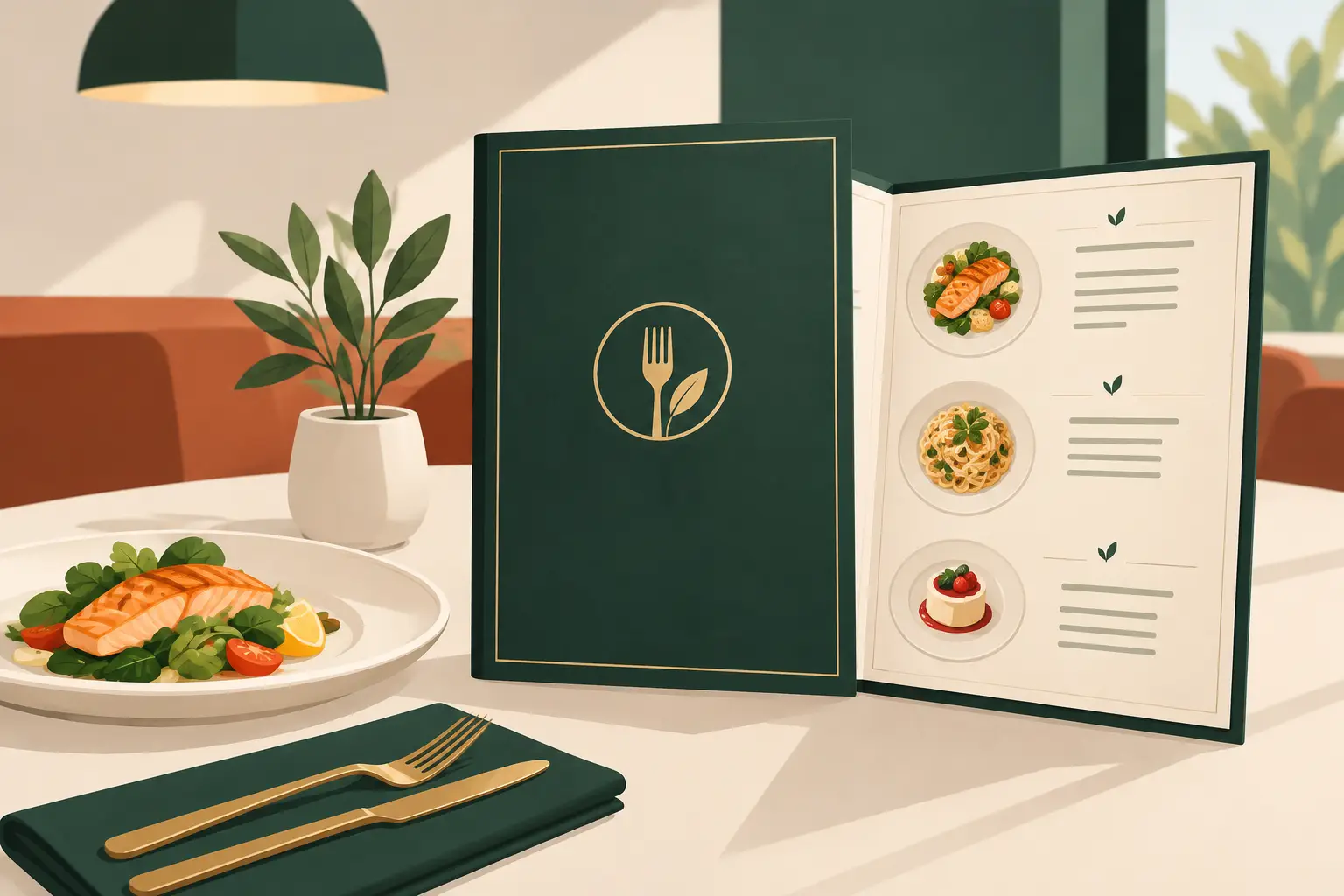
A menu is often the last sales conversation a guest has before ordering. If it is hard to scan, disconnected from your venue, or crowded with low-value choices, it can slow service and leave profitable items unnoticed. Strong restaurant menu design and branding gives guests confidence, helps staff guide decisions, and makes every dish feel like it belongs to the same experience.
For independent restaurants, cafes, bars, and hospitality operators, the menu is not decoration. It is a working sales tool that needs to hold up during a busy lunch rush, look credible online, and reflect the quality customers expect before the food reaches the table.
Start With the Business Goal, Not the Layout
A great-looking menu that does not support your commercial goals is an expensive piece of print. Before choosing fonts, colors, or paper stock, decide what the menu needs to accomplish. That might mean raising the average check, making dietary choices clearer, improving upsells, reducing ordering delays, or supporting a more premium price position.
The right approach depends on your service model. A quick-service counter menu needs immediate clarity from several feet away. A full-service dinner menu can invite more browsing and storytelling. A cocktail list may need to build anticipation and encourage a second round. One format cannot do every job well.
Begin with the numbers. Review food costs, contribution margin, preparation time, and current sales data. Identify the dishes you want to sell more often, the items that create operational bottlenecks, and the choices that no longer earn their place. Design can direct attention, but it cannot fix an unfocused offering.
Build a Clear Menu Hierarchy
Guests should understand the structure within seconds. Clear categories, logical sequencing, and consistent naming reduce decision fatigue. Put familiar decisions where people expect to find them, then use subtle cues to introduce specialities or higher-margin options.
Avoid treating every item as equally important. When every dish has a box, icon, photo, badge, and bold headline, nothing stands out. White space is not wasted space. It creates breathing room, improves scanning, and gives selected menu items a stronger visual presence.
Descriptions should earn their length. A few well-chosen details can justify a premium price and create appetite: the cooking method, a distinctive ingredient, or a local supplier relationship. Long descriptions, however, make a menu feel laborious to read. Keep the language aligned with the venue. A neighborhood burger bar and a chef-led bistro should not sound like the same business.
Restaurant Menu Design and Branding Must Work Together
Your menu is one of the most visible expressions of your brand. It should feel connected to your signage, logo, website, social content, takeaway packaging, uniforms, and photography. That consistency tells customers they are dealing with an organized, professional operation.
Branding is more than adding a logo to the cover. It is the system behind the menu: the typography that sets the mood, the color palette that creates recognition, the image style that makes food look desirable, and the tone of voice that gives dish names personality.
A coastal seafood restaurant might use restrained blues, tactile paper, clean type, and photography that emphasizes freshness. A lively late-night eatery may use high contrast, punchier language, and bolder graphic elements. Neither direction is automatically better. The test is whether it matches the customer, price point, location, and experience you are selling.
Use Color and Type With Restraint
Color can organize information and reinforce your identity, but it must remain practical. Low-contrast type may look sophisticated on screen yet become difficult to read under dim lighting. Bright backgrounds can distort when printed. A well-designed menu accounts for real-world conditions, including spilled drinks, fingerprints, and hurried readers.
Typography should be distinctive without becoming a barrier. Use a clear typeface for item names, prices, and descriptions, then reserve more expressive lettering for headings or short brand moments. Too many font styles make the menu look improvised. A controlled system feels more premium and is easier to update later.
Photography needs the same discipline. High-quality food images can increase appeal in casual dining, delivery, and quick-service settings, especially when customers need a fast visual cue. In a more elevated setting, too many images can weaken the sense of craft. If photography is used, it needs to be consistent in lighting, styling, and composition. One excellent image is more valuable than six mismatched ones.
Make Profitable Choices Easier to Notice
Menu engineering and design should support each other. Once you know which dishes have healthy margins and genuine customer appeal, use hierarchy to make them easier to discover. This can be as simple as placement, a concise callout, a small chef’s recommendation, or stronger spacing around an item.
Do not rely on gimmicks. Overusing badges such as “best seller,” “must try,” or “staff favorite” makes recommendations feel less believable. Select one or two features that fit your concept and rotate them when needed. A seasonal highlight works best when it is actually seasonal.
Price presentation also affects perception. A column of dollar signs encourages direct price comparison, which can push guests toward the lowest-cost option. Integrating prices neatly with item descriptions often creates a more considered reading experience. That said, transparency matters. The goal is not to hide prices, but to prevent the menu from becoming a spreadsheet.
Cross-selling should feel useful rather than pushy. Pair a burger with a side that improves the meal, recommend a wine by the glass beside an entrée, or make add-ons easy to understand. Good menu prompts help guests build the order they already want.
Design for Operations, Not Just the First Print Run
A menu is a live business document. Prices change, suppliers change, specials rotate, and dietary information must stay accurate. If every small update requires rebuilding the entire file, your team will either delay changes or create inconsistent versions.
A practical design process establishes reusable templates and clear rules from the start. That might include a main dine-in menu, drinks list, dessert insert, kids’ menu, counter board, takeaway version, and digital PDF. Each asset should use the same approved logo files, colors, fonts, and writing style while being designed for its own setting.
Print specifications matter. Consider size, fold type, paper weight, coating, binding, and durability before finalizing the layout. A single-page menu may suit a fast-turnover cafe. A bound or folded format may better support a larger dinner offering. Lamination can improve durability, but it can also create glare under overhead lights. There is always a trade-off between appearance, cost, and day-to-day use.
Make sure the final package includes production-ready files as well as editable source files where appropriate. Your printer needs correctly sized files, bleed, safe margins, and suitable color settings. Your internal team needs a simple process for requesting future updates. These details prevent avoidable reprint costs and last-minute errors.
A Practical 3P Menu Process
The most reliable menu projects are collaborative, but they are not open-ended. A structured process keeps the work moving and reduces subjective feedback.
Personal means getting close to the business. Review the concept, customer profile, service style, existing brand assets, sales priorities, and operational limitations. This is where the visual direction and menu strategy take shape.
Practical means designing around real decisions. Confirm the menu sections, item count, descriptions, dietary markers, pricing approach, photography needs, print format, and update schedule before design moves too far. A clear content checklist saves time and avoids revision cycles caused by missing information.
Professional means delivering a finished system, not a mockup. The final rollout should include approved print files, digital versions, a defined revision process, and consistent specifications for related customer touchpoints. That gives your team a menu they can use confidently and a foundation for future promotions.
Brandcrafter approaches menu and collateral work as part of the wider customer journey. When your menu, flyers, business cards, photography, and website speak the same visual language, customers receive a clearer signal about the standard of your business.
Review the Menu Where Customers Use It
Before approving a final print run, test the menu in the actual environment. Place it on a table under your usual lighting. View it at the counter. Check it on a phone if guests will access a digital version. Ask staff to use it during a service period and note where customers hesitate or ask repeated questions.
Look for small problems that become expensive at scale: type that is too small, dietary icons that are unclear, descriptions that wrap awkwardly, prices that are inconsistent, or category labels that customers misread. Staff feedback is especially valuable because they see the friction that management may miss.
The strongest menu does not demand attention through decoration. It makes the next choice feel easy, reinforces why your venue is worth choosing, and gives customers one more reason to come back.