You only notice a “not print-ready” PDF when it’s already expensive – a flyer run comes back with fuzzy logos, cropped text, or colors that shifted from your screen to something dull and muddy.
Most of the time, the design isn’t the real problem. The handoff is. Print has rules, and your PDF has to match them.
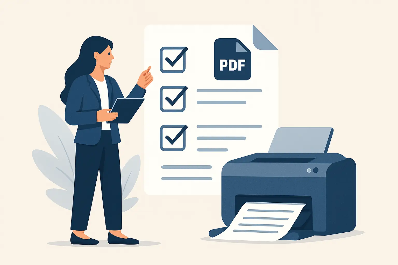
This practical guide breaks down print ready pdf requirements in plain terms, with the decisions that matter, the trade-offs that can surprise you, and the simple checks that prevent reprints.
What “print-ready” really means (and what it doesn’t)
A print-ready PDF is a file a print shop can output immediately, without guessing. It contains the correct page size, the right color space, adequate image resolution, embedded fonts, and allowances for trimming.
It does not mean “looks fine on my laptop.” Screens preview RGB color, ignore trim tolerances, and can hide missing-font issues because your computer substitutes fonts silently. A printer’s RIP (the software that converts your PDF into printable plates or digital output) is far less forgiving.
If you want a simple mental model, a print-ready PDF removes ambiguity. The less your printer has to “fix,” the more predictable your result.
The non-negotiables in print ready pdf requirements
There are a handful of specs that come up on almost every job: business cards, real estate flyers, menus, door hangers, signage. Get these right and you eliminate the most common reasons jobs get delayed.
1) Correct trim size (your final finished size)
Your PDF must match the final cut size exactly. A US flyer might be 8.5 x 11 inches, a postcard might be 5 x 7, and a business card is often 3.5 x 2 (though some printers use different standards).
If the PDF page size is wrong, the printer either scales it (bad for margins and readability) or flags it for correction.
Trade-off: scaling can seem like an easy fix, but it changes border thickness, moves elements closer to edges, and can make type look slightly off. Better to export at the exact size.
2) Bleed (the safety margin that prints past the edge)
Bleed is extra artwork beyond the trim line so the finished piece has color all the way to the edge after cutting. If you have any background color, photos, or shapes that touch the edge, you need bleed.
Common bleed is 0.125 inches (1/8 inch) on all sides in the US. Some large-format or specialty jobs can vary, so you still want to confirm with the printer.
If you skip bleed, you risk thin white slivers along the edge after trimming. Even excellent printers can’t cut every sheet with microscopic perfection.
3) Safe area (keep critical text away from the cut)
Bleed handles the outside. Safe area handles the inside.
Keep important text and logos comfortably inside the trim edge so minor shifts in cutting don’t clip anything. A typical safe margin is at least 0.125 inches from the trim, and 0.25 inches is often a smarter target for small pieces like business cards.
If your design uses borders, be extra cautious. Borders magnify tiny trim shifts and are one of the most common “this looks wrong” print outcomes.
4) Color mode: CMYK (usually) and what to do with black
Most print production expects CMYK. Screens use RGB. That’s why a bright neon green on screen can print as a calmer, more muted green.
If you deliver an RGB PDF, some printers will convert it for you. Others will reject it. Either way, you lose control of the conversion.
For black, pay attention to intent:
If it’s small text, you typically want 100% K (black only). This prints cleaner and reduces registration issues.
If it’s a large black background, many workflows use “rich black” (a CMYK mix) to get a deeper tone. The exact values vary by printer and paper, so this is a place where it depends. If you don’t have guidance, ask before exporting.
5) Image resolution: 300 DPI at final size
For most standard print pieces, images should be effectively 300 DPI at the size they will appear in the layout.
Two common traps:
First, dropping in a web image that is 1200 pixels wide and then stretching it across a full flyer. It will look fine on screen and print soft.
Second, assuming “high resolution” means “large file size.” A huge file can still be low effective resolution if the image is scaled up.
Logos are a special case. Vector logos (AI, EPS, or vector PDFs) scale cleanly to any size. If your logo is a low-res PNG, it will eventually show its limits in print.
6) Fonts embedded (or converted properly)
Missing fonts can reflow text, break spacing, or substitute a lookalike font that changes your entire layout.
Your print-ready PDF should have all fonts embedded. Many export presets do this automatically, but not all.
If you can’t embed a font due to licensing restrictions, you may need to outline the text. That removes editability, which can be fine for final print, but it can also slightly change how type renders and it can make small type heavier. Use it deliberately, not as a default.
7) Flattening and transparency (when it matters)
Modern PDF standards handle transparency well, but certain printers and older RIPs still have issues with complex transparency, overprints, and blend modes.
If your printer asks for a specific PDF version (like PDF/X-1a), they’re trying to eliminate those variables. It can feel old-school, but it’s often about reliability.
PDF standards: PDF/X-1a vs PDF/X-4
If a printer provides a spec sheet, follow it. If they don’t, these are the two standards you’ll hear most:
PDF/X-1a is more restrictive. It typically flattens transparency and expects CMYK (and spot colors if used). Many trade printers still prefer it because it reduces surprises.
PDF/X-4 is more modern. It supports live transparency and color-managed workflows. Many quality printers accept and prefer it.
The trade-off is compatibility. If you’re printing somewhere with older equipment, PDF/X-1a can be the safer bet. If you want the best handling of modern effects and a smoother workflow, PDF/X-4 is usually fine.
Spot colors, Pantone, and brand consistency
If your brand relies on a very specific color (think a signature teal on a hospitality menu or a property brand’s distinctive orange), you might consider spot color.
Spot colors can improve consistency, but they also affect cost and production options. Not every job needs it. Many small-business pieces are printed CMYK digital, where Pantone is approximated anyway.
What matters is intent: are you optimizing for lowest cost, fastest turnaround, or highest consistency across reprints? Your “right” requirement changes based on that answer.
Finishing changes the file requirements
Print-ready isn’t just about ink on paper. Finishing affects your PDF setup:
If you have a fold (like a tri-fold brochure), panel sizes matter and you may need a specific template so folds don’t land on text.
If you have die cuts, rounded corners, or a hang hole, you’ll need a dieline layer in the file and clear labeling.
If you have bleed plus a matte laminate, dark edges and banding can become more noticeable, so image quality and solid color builds need more care.
This is where many “my PDF is correct” jobs still go wrong: the PDF is technically fine, but it wasn’t built for the finishing method.
A quick preflight you can do before sending
You don’t need to be a print tech to catch 90% of issues.
Open the PDF and zoom to 200-400%. Check small text, thin lines, and logo edges. If anything looks jagged or blurry at that zoom, it will likely print worse.
Confirm page size in your PDF viewer’s document properties. Make sure it matches the trim size, not the size including bleed.
Visually check bleed by toggling on trim and bleed marks if your export includes them, or by confirming the background extends past the intended cut.
Finally, scan for accidental RGB by looking at how vibrant certain colors appear. This isn’t a perfect method, but if you see super-bright neon colors that look “screeny,” that’s a clue you should verify the export settings.
Common rejection reasons from print shops (and the fast fix)
If a printer flags your file, it’s usually one of these:
No bleed on an edge-to-edge design. Fix by extending the background and re-exporting with bleed.
Low-resolution images. Fix by replacing with higher-res images or resizing the layout so the image prints smaller.
RGB file. Fix by converting to CMYK during export, ideally with the printer’s preferred profile if provided.
Fonts not embedded. Fix by changing export settings, packaging fonts properly, or outlining as a last resort.
Wrong size. Fix by adjusting the document size in your design file, not by scaling at export.
If you’re working with a designer, this is where a structured handoff saves time. At Brandcrafter.co.nz, our collateral workflows are built around a practical production checklist so clients aren’t stuck relaying printer feedback back and forth or paying for avoidable revisions.
What to ask your printer before you export
If you want to eliminate back-and-forth, ask three questions upfront.
First: “What final trim size and bleed do you require?” Even when 0.125 inches is common, confirmation prevents assumptions.
Second: “Do you prefer PDF/X-1a or PDF/X-4?” Their answer tells you how strict they need the file to be.
Third: “Is this printing digital CMYK or with spot colors?” That determines how seriously you should treat Pantone matching and rich black guidance.
Those three questions take two minutes and can save days.
Closing thought
A print-ready PDF isn’t about perfection. It’s about predictability. When your file leaves no room for interpretation, you get faster approvals, fewer production calls, and marketing pieces that show up looking like your brand – not a “close enough” version of it.