
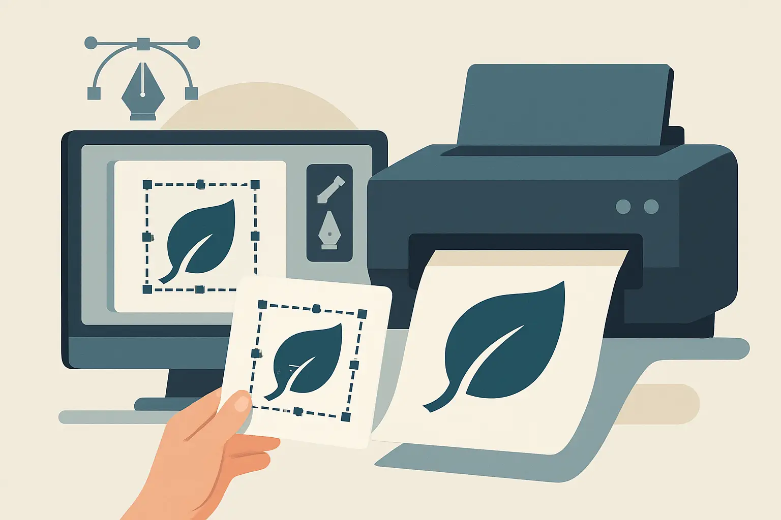
Your logo looks fine on Instagram. Then you try to print it on a storefront sign, stitch it on a hat, or drop it into a business card layout – and it turns fuzzy, jagged, or weirdly pixelated. That is not a “printer problem.” It is almost always a file problem.
A logo vectorization service fixes that problem by rebuilding (or converting) your logo into true vector artwork, so it scales cleanly from a tiny app icon to a 10-foot banner without losing quality. If you are running a small business, managing multiple vendors, or getting serious about signage and uniforms, vector files are not a nice-to-have. They are the difference between a brand that looks credible everywhere and one that looks “close enough” until it really matters.
What “vectorized” actually means (and why it matters)
Most logos start life in one of two places: as a raster image (pixels) or as a vector file (shapes). Raster files include JPG, PNG, and screenshots. They are made of pixels, which means they have a fixed resolution. When you scale them up, the pixels stretch and the edges degrade.
Vector files are built from paths and shapes. Instead of saving “this many pixels,” a vector saves “this curve goes here, this line has this thickness, this fill is this color.” That math-based structure is why vectors can scale infinitely.
If you are sending your logo to a printer, sign shop, embroiderer, vehicle wrap vendor, or even a web developer, they will often ask for AI, EPS, or SVG. That is the vendor’s way of saying, “We need the real thing, not a screenshot.”
When you need a logo vectorization service (common scenarios)
Vectorization is most valuable when you are trying to use your logo in real-world production where quality control is unforgiving. If any of the following feel familiar, you are in the right place.
If you only have a PNG pulled from your website, a JPG from an old email, or a photo of a logo on a business card, you do not actually have production-ready logo files. You have an image.
If your logo prints with rough edges on a business card, breaks apart when enlarged on a banner, or looks blurry on packaging, you are feeling the limits of raster files.
If vendors keep asking for “vector format,” “outlined text,” or “EPS,” they are telling you their workflow depends on vectors. Some will try to convert your file themselves, but that is where mistakes creep in, and those mistakes come back to you as reprint costs and delays.
If you are rebranding lightly – maybe tightening spacing, modernizing type, or standardizing colors – vectorization is often step one. You want a clean master file before you roll out new collateral.
What you should receive from a professional vectorization
A proper vectorization is not just a single file attachment. It is a small, practical set of outputs that lets you use your logo across print, web, and vendor production without guessing.
At minimum, you want an editable vector master (AI or EPS) and a scalable web vector (SVG). From there, you typically want high-resolution PNG exports with transparent backgrounds, and a PDF that is easy to preview and share. If you are dealing with print vendors, you also want color versions prepared for real production: CMYK for print, RGB for screens, and a one-color version for stamping, etching, embroidery, or vinyl cutting.
The difference between “converted” and “prepared” is where quality lives. A prepared set accounts for how the logo will actually be used, not just whether it technically opens in Illustrator.
The vectorization process (what happens behind the scenes)
Good vectorization is part technical, part judgment. The goal is a logo that is accurate to your original but also structurally clean and production-friendly.
First, the designer evaluates the source. If you provide a high-res raster (or, best case, an old AI/EPS/PDF), the rebuild is faster and more faithful. If the only source is a tiny screenshot, the work shifts from conversion to reconstruction, and some interpretation may be required.
Next comes redrawing. This is where the logo is recreated with precise paths, consistent geometry, and clean curves. A strong vector file has intentional anchor points – not hundreds of unnecessary nodes that make the logo fragile and hard to edit later.
Then the designer checks spacing, alignment, and proportion. Even if you want it to match the original exactly, small inconsistencies in low-quality files become obvious once you rebuild it cleanly. This is often where the logo starts to look more “professional” without changing the concept.
Finally, the artwork is tested at extremes. It should look sharp small and large. It should hold up in one color. It should export cleanly. And it should behave predictably when a vendor drops it into their production pipeline.
Auto-trace vs. hand vectorization (it depends)
Many tools offer “image trace” or instant vector conversion. Sometimes that is enough. Often, it is not.
Auto-trace can work for very simple, high-contrast marks – like a bold icon with solid shapes and no fine detail. Even then, you still need cleanup to reduce messy points and ensure smooth curves.
Hand vectorization is the safer choice when your logo includes type, thin lines, gradients that need simplification, complex shapes, or any detail that must reproduce consistently. It is also the better choice if you plan to use the logo for embroidery, vinyl cutting, signage, or anything where tiny imperfections turn into real production problems.
If speed is the only priority, auto-trace is tempting. If reliability is the priority – especially when multiple vendors are involved – hand vectorization is usually the smarter investment.
How to spot a bad vector file before it costs you
Not all vector files are created equal. You can receive an EPS that technically qualifies as “vector” but still causes problems.
One red flag is a file that looks fine at first glance but produces wobbly edges, uneven curves, or distorted letterforms when scaled. Another is a logo that has too many anchor points – it may look acceptable, but it becomes difficult to edit and can print unpredictably.
Type is another common issue. If fonts are not outlined or properly embedded, your logo can reflow or substitute fonts when opened on a different computer. That is how spacing changes and letters shift.
Color handling matters too. If your file is built in RGB only, you may get unexpected color shifts in print. A professional vector package anticipates that and provides the right versions for the right use cases.
What to send to your designer to get the best result
Vectorization moves fastest when you provide the best source material you have and a little context.
Send every version of your logo you can find, even if they look similar. An old PDF from a printer, a previous designer’s folder, or a file pulled from signage proofing can contain cleaner reference than a website image. If you know the brand colors (HEX, RGB, CMYK, or Pantone), share them. If you do not, a designer can match visually, but you are better off confirming the color targets now rather than after you have printed 500 flyers.
Also tell them how you plan to use the logo in the next 30-90 days. Business cards, truck decals, storefront signage, uniforms, social media templates – this affects which file versions are prioritized and how the logo should be tested.
A practical deliverables checklist (what to ask for)
If you want to avoid back-and-forth with vendors, ask for a package that includes at least the following:
- AI or EPS vector master file (editable)
- SVG for web and modern digital use
- PDF proof file for easy viewing and sharing
- PNG exports with transparent background (at least one full color, one black, one white)
- Color versions prepared for print and screen (CMYK and RGB)
If you will be doing signage, embroidery, or vinyl cutting, also request a simplified one-color version and confirm minimum line thickness so details do not fill in or disappear.
How to think about pricing and turnaround
Vectorization pricing depends on complexity and on the quality of the source file. A simple icon with clean edges is fast. A detailed crest pulled from a low-res screenshot takes longer because it is essentially a rebuild.
Turnaround is also affected by how quickly you can confirm accuracy. If your goal is “match this exactly,” you should expect at least one proof step where you verify shapes, spacing, and color targets.
If you are bundling vectorization with other brand assets – business cards, flyers, or a light refresh – you can often reduce total time because the same designer is preparing files for multiple outputs at once.
How vectorization fits into a brand system (not just a file fix)
A clean vector logo is the foundation for everything that follows. Once your logo is properly built, creating consistent collateral becomes faster and cheaper. Your business card layout holds up. Your flyer templates reuse the same assets. Your website header stays sharp. Your social exports look consistent. Vendors stop emailing you asking for different formats.
This is why we treat vector files as production infrastructure, not an afterthought. If you want a dependable, process-led approach to rebuilding and packaging your logo files for real-world use, Brandcrafter typically handles vector-ready deliverables as part of a wider rollout mindset – so your logo, card, and flyer assets stay aligned as you grow.
The practical win is simple: you stop solving the same problem every time you order something new.
A helpful closing thought
Before you spend money on the next sign, uniform order, or print run, make sure your logo is a true vector with the right exports. It is one of the few small upgrades that removes friction from every marketing task that comes after – and it pays you back each time a vendor says, “Perfect, that file is exactly what we need.”