
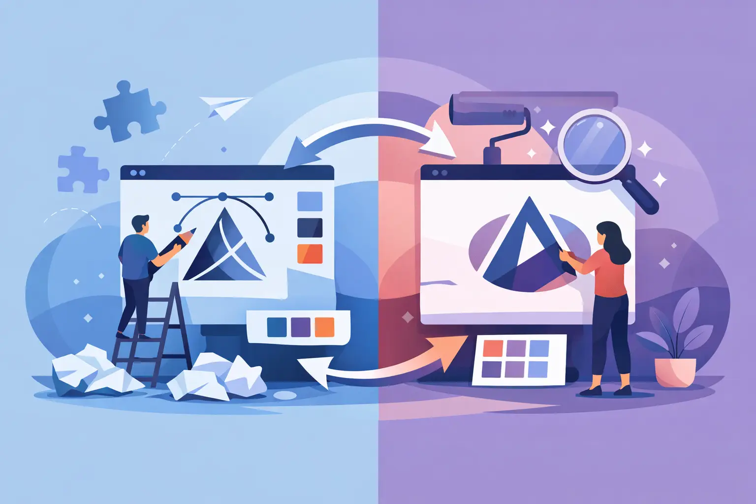
A dated logo can quietly chip away at trust long before customers say a word. If your brand looks inconsistent across signage, social media, business cards, and sales materials, the real question is not whether to update it. It is logo redesign vs logo refresh – and choosing the right level of change for where your business is now.
For small and mid-sized businesses, this decision is rarely about design trends. It is about fit. Does your current logo still reflect your offer, your market, and the way customers experience your business? Or has your business grown while your visual identity stayed behind?
What logo redesign vs logo refresh actually means
A logo refresh is a controlled update. You keep the core identity, but improve how it works. That might mean refining the typography, simplifying shapes, adjusting spacing, modernizing the icon, or tightening the color system so it reproduces better in print and on screen.
A logo redesign is a deeper change. It often starts by rethinking the logo from the ground up because the current mark no longer matches the business. The name, positioning, audience, product mix, or market perception may have changed enough that small tweaks will not solve the problem.
The easiest way to think about it is this: a refresh improves recognition you already have, while a redesign rebuilds alignment.
Neither option is automatically better. The right move depends on how much has changed in your business, how strong your current recognition is, and how quickly you need to roll out updated brand assets.
When a logo refresh is the smarter move
A refresh works best when the brand still has equity. Customers recognize it. Your team uses it. It appears on uniforms, vehicles, menus, documents, packaging, or storefronts. The issue is not that the logo is wrong. It is that it feels dated, inconsistent, or difficult to use.
This is common with local service businesses, hospitality operators, and established companies that have built trust over time but never cleaned up the visual system. The logo may have too many details, weak file quality, or color choices that do not hold up across print and digital formats.
A refresh is often the practical choice if your goals are operational as much as visual. You want a cleaner logo, better file formats, stronger legibility, and a more consistent look without confusing existing customers.
Signs you likely need a refresh
Your logo still feels familiar to your market, but parts of it are underperforming. Maybe the font looks dated, the icon does not scale well, or your current files are a patchwork of screenshots and old PDFs. Maybe the logo works on a sign but fails on a website header or social profile.
A refresh also makes sense when your business has matured but not fundamentally changed. You offer the same core service, serve the same audience, and want to look more professional without resetting your identity.
In these cases, the value is speed and continuity. You preserve what customers already know while making the brand easier to apply across everyday touchpoints.
When a logo redesign is the right call
A redesign is usually the better choice when the business has outgrown the logo at a strategic level. That can happen after a merger, expansion, repositioning, name change, or major shift in audience. It can also happen when the original logo was rushed, overly generic, or never built on a clear brand foundation.
If customers consistently misunderstand what you do, the issue may not be just visual polish. Your logo may be signaling the wrong category, wrong quality level, or wrong personality. In that case, refreshing the old mark can keep you tied to a message that no longer serves the business.
A redesign gives you room to reset. It lets you define what the brand should communicate now, then build a logo system around that decision.
Signs you likely need a redesign
Your business has changed meaningfully, but your logo still represents an earlier version of the company. You may have moved upmarket, broadened your services, entered a new region, or shifted from owner-led hustle to a more established operation.
A redesign is also worth considering if the current logo has no real recognition to protect. That is often the case with newer businesses, inconsistent branding, or marks that were never professionally developed in the first place.
If the visual identity creates confusion, looks untrustworthy next to competitors, or cannot support future growth, a redesign can be the lower-risk move long term. It avoids spending money patching a logo that will still need replacing later.
The trade-off: familiarity vs forward movement
This is where logo redesign vs logo refresh becomes a business decision, not just a design decision.
A refresh protects familiarity. That matters if customers already know your brand and you rely on repeat business, local recognition, or visible physical assets like signage and vehicles. The trade-off is that you are working within existing constraints. You can improve the logo, but you may not solve deeper brand issues.
A redesign creates stronger forward movement. It can sharpen your positioning and improve how the market perceives your value. The trade-off is that it requires more planning, stronger rollout discipline, and a willingness to let go of what feels familiar.
Neither path is risk-free. A refresh can be too soft if the business truly needs a reset. A redesign can be too aggressive if customers strongly associate with your current look. The best decision usually comes from looking at both brand strategy and practical rollout costs together.
How to choose without overcomplicating it
Start with three questions.
First, has the business changed, or has only the style aged? If the strategy is stable and the appearance is the problem, a refresh is often enough. If the business model, audience, or positioning has shifted, a redesign deserves serious consideration.
Second, how much recognition does the current logo have? If people know it, trust it, and connect it to your business, preserving some continuity matters. If nobody would notice it disappearing, you have more freedom.
Third, where does the logo need to work? This is the practical filter many businesses skip. A logo that looked acceptable a decade ago may break down on mobile screens, embroidered uniforms, digital ads, flyers, and modern website layouts. If usability is the main issue, a refresh with cleaner assets may solve a lot quickly.
That is why a process-led review helps. At Brandcrafter, we look at logo performance across real-world brand touchpoints, not just in isolation. A smart update should improve how the logo works on business cards, flyers, websites, social graphics, and signage – not just make it look newer on a presentation slide.
Budget, timing, and rollout matter more than most people think
A refresh is usually faster and more cost-effective because the strategic foundation is already there. The approval cycle tends to be tighter, and the rollout is easier because the visual shift is smaller.
A redesign usually requires more discovery, more concept development, and more implementation planning. That is not a downside if the business needs it. It just means the project should be approached with clear checkpoints, revision structure, and a practical asset list.
For business owners, this matters because the logo is never the only deliverable. Once the mark changes, everything attached to it needs attention. Files, brand colors, alternate versions, print applications, and digital formats all need to be considered. If that handoff is messy, the brand ends up looking inconsistent even after investing in a new identity.
This is why the strongest branding projects are not just about the logo itself. They are about getting usable deliverables that support the next phase of the business.
A simple rule for deciding
If your logo still represents your business but needs to perform better, choose a refresh.
If your logo no longer represents your business, choose a redesign.
That sounds simple because it is. The hard part is being honest about whether the problem is cosmetic or strategic. Many businesses ask for a refresh because it feels safer, when what they really need is a clearer repositioning. Others push for a redesign when a well-executed refresh would protect hard-earned recognition and save time.
The best branding decisions are not the boldest ones. They are the ones that match your stage of growth, your customer expectations, and your day-to-day marketing needs.
If you are weighing logo redesign vs logo refresh, focus less on what sounds more impressive and more on what will give your business a clearer, more consistent presence across every place customers see you. A good logo update should not create extra noise. It should make the next decision easier.