
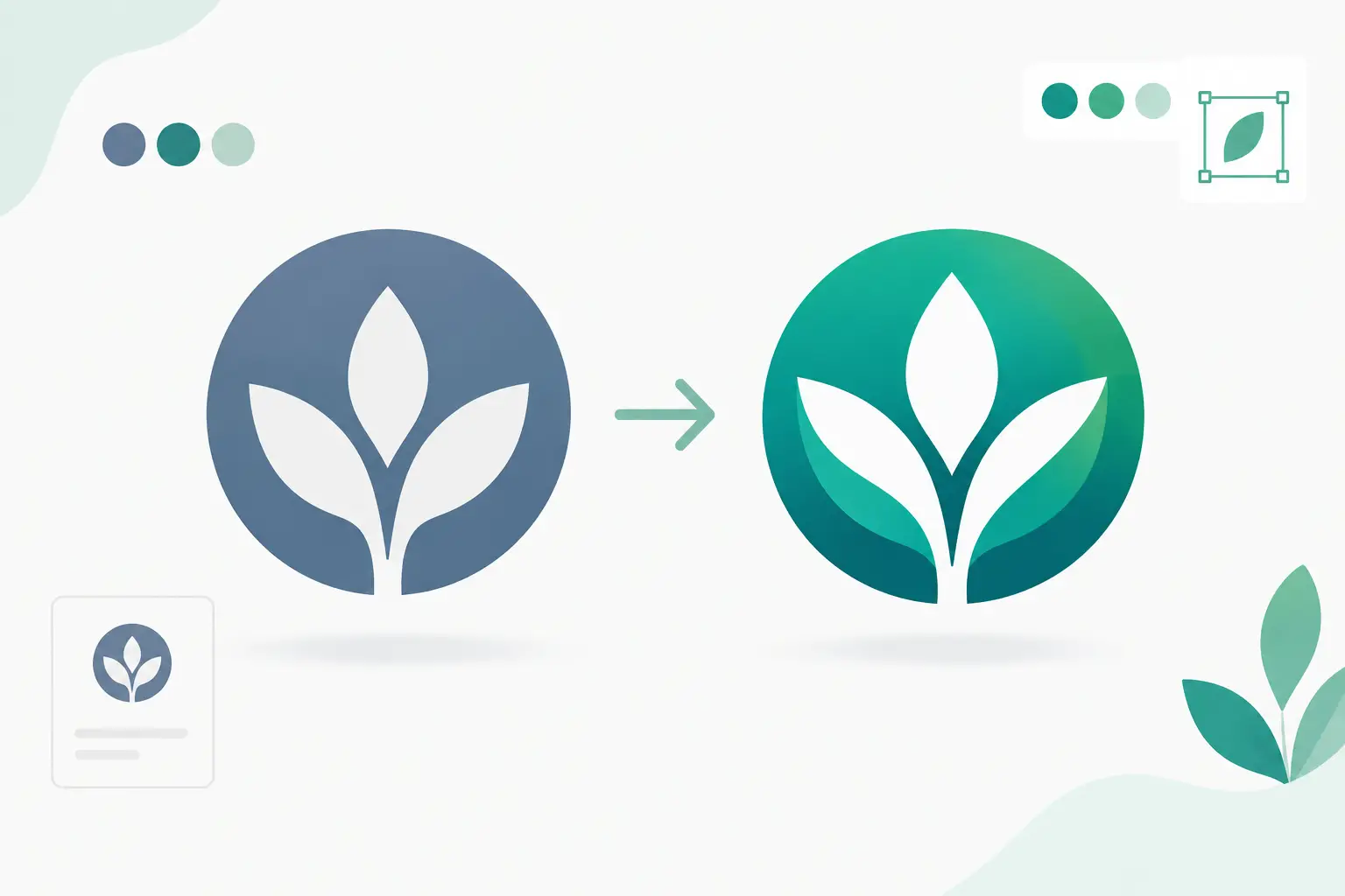
A logo refresh can solve a familiar problem: your business has grown, but the mark on your truck, storefront, website, or business card still looks like it belongs to the version of the company you started years ago. Knowing how to refresh a logo is not about chasing a design trend. It is about making your brand clearer, more credible, and easier to use while preserving the recognition you have already earned.
For a local service business, hospitality operator, or growing small business, that distinction matters. A full rebrand can create confusion and add cost across every customer touchpoint. A focused refresh gives you a stronger working identity without forcing customers to relearn who you are.
Start by deciding whether you need a refresh or a redesign
A logo refresh updates the way your brand is presented. It may simplify the icon, improve the typeface, adjust proportions, modernize the color palette, or create cleaner versions for digital and print use. The core idea stays recognizable.
A redesign changes the fundamental identity. This may be necessary when the business has changed direction, merged with another company, entered a new market, or has a name and visual style that no longer reflect what it sells. It is a bigger decision because it asks existing customers to form a new visual association.
Most established businesses benefit from a refresh when the issue is execution rather than strategy. Your logo may feel dated, overly detailed, hard to read at small sizes, or inconsistent across materials. Those are practical design problems with practical solutions.
A redesign is more appropriate when the current identity sends the wrong message. For example, a premium property service using a playful, low-cost-looking logo may need more than a typeface adjustment. The design needs to match the market position the business is working toward.
How to refresh a logo with a clear brief
Good logo refreshes begin before any design concepts are created. Start with a short, direct brief that explains what must improve and what must remain familiar. This avoids subjective feedback such as “make it pop” and keeps revisions tied to business goals.
Define the customer you want to attract, the qualities you want the brand to communicate, and where the logo appears most often. A contractor may need immediate readability on vehicles and uniforms. A café may need a mark that works on signage, menus, packaging, and social posts. A professional service firm may need a more confident identity that supports higher-value work.
Then identify the assets worth keeping. It could be a distinctive symbol, a recognizable color, the business name, or a particular shape customers already associate with you. You do not need to preserve every element. You need to retain the cues that carry recognition.
It also helps to name the non-negotiables. If your logo must work in one color for embroidery, fit inside a social media profile image, and reproduce clearly on a business card, say so from the start. These requirements shape better creative decisions than personal preference alone.
Audit the logo where customers actually see it
A logo can look acceptable in a large presentation file and fail everywhere else. Before changing it, gather the real-world examples: your website header, email signature, invoices, uniforms, signage, vehicle graphics, flyers, social posts, and printed cards.
Look for four common issues:
- Fine lines, small text, or detailed artwork that disappears at small sizes
- Colors that reproduce differently across screens, print, fabric, and signage
- Multiple unofficial versions created over time by different suppliers
- Spacing, proportions, or file quality that make the business look less professional
This audit often reveals that the business does not only need a better logo. It needs a usable logo system. A cleaned-up primary logo, a compact version, an icon, and clear file formats can eliminate day-to-day inconsistency before it spreads further.
Simplify for the smallest application first
The strongest refreshes usually remove friction. They simplify shapes, improve spacing, strengthen contrast, and make the name easier to read. This can feel counterintuitive if you are attached to details in the current mark, but customers rarely study a logo for long. They need to recognize it quickly.
Start by testing the logo at the smallest size you use. If it cannot be recognized in a browser tab, social profile image, email signature, or business card, it needs refinement. A simplified logo will often perform better on a large sign too, while the reverse is not always true.
Typography deserves particular attention. Outdated, overly decorative, or tightly compressed type can make even a capable business look less established. A refreshed typeface should fit your industry and be easy to reproduce, not just look impressive in a mockup.
Color should support recognition and usability. You may keep a familiar color but adjust its tone for better contrast and more reliable reproduction. If the logo relies on several colors, it should still work in solid black and white. That single-color version is essential for stamps, embroidery, faxed documents, low-cost printing, and certain promotional materials.
Protect what customers already recognize
The trade-off in a logo refresh is simple: change too little, and the business still looks dated; change too much, and you lose the value built into the existing identity. The right balance depends on how well known the current logo is and how much goodwill it carries.
If customers recognize your shape or symbol, retain its basic silhouette while refining it. If the business name is the key recognition asset, preserve the name treatment or its overall character. If your color is closely associated with the business, evolve it carefully rather than replacing it without a reason.
This is especially relevant for businesses with physical locations, repeat customers, and referrals. People may not remember every design detail, but they recognize visual patterns. A refresh should make those patterns clearer, not erase them.
Build logo versions for real operating needs
One logo file is not a complete brand identity. Different spaces require different formats, and trying to force a wide horizontal logo into every placement creates weak results.
A practical refresh should include a primary logo for standard use, a stacked or compact variation for narrow spaces, a standalone icon or monogram where appropriate, and one-color versions for restricted production methods. Each version should have a defined job, so staff and suppliers are not left guessing.
The final file package matters as much as the artwork. You should receive vector files for print, signage, and scaling, along with high-resolution raster files for everyday documents and digital use. Commonly, this includes AI or EPS files, PDF files, SVG files for web use, and PNG files with transparent backgrounds. JPG files can be useful for basic sharing, but they are not a substitute for production-ready master files.
A simple usage guide adds control. It should show approved colors, typefaces, spacing rules, and which logo version to use in common situations. This is not corporate red tape. It is what keeps a flyer, business card, website, and vehicle decal looking like they belong to the same business.
Use structured feedback instead of endless revisions
Logo feedback works best when it is specific and tied to the brief. Rather than asking every team member which option they personally like, ask whether the concept looks credible to your intended customer, is clear at a small size, fits the business personality, and works across required applications.
Limit feedback to the people who understand the business and can make decisions. Too many opinions tend to produce a logo designed by compromise, where every meaningful choice has been softened. A defined review process with clear revision rounds is faster, more affordable, and more likely to produce a confident result.
At Brandcrafter, this is the practical value of a 3P Method approach: keep the collaboration personal enough to understand the business, practical enough to work across everyday materials, and professional enough to produce consistent final assets.
Roll out the refresh in the right order
Once the refreshed logo is approved, update the customer-facing essentials first. Your website, Google Business Profile imagery, social profiles, email signature, business cards, and current promotional materials should be aligned before less visible items. This gives customers a consistent experience at the points where they decide whether to contact or trust you.
Then move through physical assets based on replacement cycles and visibility. There is rarely a need to discard every item overnight. Use existing stock where it makes financial sense, but set a clear cutoff so old and new logo versions do not coexist indefinitely.
A short announcement can help if the refresh is noticeable, especially for a business with loyal customers. Keep the message simple: the business is the same, the presentation is stronger, and the improvement reflects where you are headed. Do not overexplain the design. Show confidence in it.
Your logo does not need to look radically different to make a stronger commercial impression. It needs to be clear, recognizable, and ready to perform wherever customers meet your business. Treat the refresh as a working upgrade, and it will support the next stage of growth without losing the trust you have already built.