
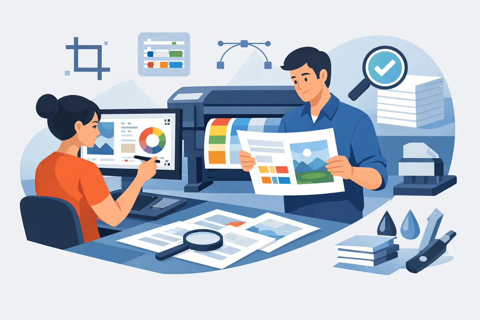
A flyer that looked sharp on your screen can come back from print with blurry logos, unexpected cropping, dull color, or tiny white edges. Most of the time, that is not the printer failing. It is a file setup problem.
If you want clean, professional print results, file prep needs to be treated as part of the design process, not an afterthought. This is especially true for business cards, flyers, menus, signage, and promotional collateral where one small setup mistake can affect hundreds or thousands of printed pieces.
The good news is that learning how to prepare files for a printer is not complicated once you know what matters. The key is working through the file in a practical order so nothing gets missed.
How to prepare files for a printer without costly mistakes
The best print files are built backwards from the finished item. Before you touch export settings, confirm the final trim size, stock type if relevant, quantity, and printing method. A business card, folded flyer, poster, and large-format sign all have different setup needs. If you skip this step and design first, you usually end up rebuilding later.
Trim size is the finished size after cutting. That sounds basic, but it affects everything from layout proportions to bleed. If your flyer is meant to be 5.5 x 8.5 inches, your file should not be built as a full letter-size page and left for the printer to guess. Printers work best from exact specifications.
Resolution comes next. For most print jobs, images should be 300 DPI at final size. That last part matters. A photo can be 300 DPI in one context and still print poorly if it is stretched too large in the layout. Logos and icons are better supplied as vector files whenever possible because they stay crisp at any size.
Color mode is another common failure point. Files for print should usually be built in CMYK, not RGB. RGB is made for screens and can display brighter, more electric color than a printer can reproduce. If you design in RGB and convert at the end, some colors will shift, especially bright blues, greens, and oranges. If brand accuracy matters, set expectations early and build with print reality in mind.
Set up the document correctly from the start
A clean print job starts with a clean working file. That means correct dimensions, proper bleed, and safe margins.
Bleed is the extra image area that extends beyond the trim edge. In most commercial printing, that is 0.125 inches on each side. If a background color, photo, or graphic touches the edge of the finished piece, it must extend into the bleed. Without it, you risk thin white lines after trimming. Those lines make even a good design look cheap.
Safe margin is the opposite idea. Keep text, logos, and critical details slightly inside the trim line so they are not cut off or sitting too close to the edge. A common safe area is 0.125 to 0.25 inches inside the trim, depending on the product. The tighter the format, like a business card, the more disciplined you need to be.
If the piece folds, add one more layer of planning. Folded brochures, menus, and mailers need panel widths that account for folding mechanics. A standard tri-fold, for example, often needs one panel slightly narrower so it folds cleanly. Equal-looking panels are not always equal in production.
Images, logos, and graphics need the right source files
This is where many otherwise solid designs fall apart. Pulling images from a website, social media page, or screenshot nearly always creates quality problems in print. If the source asset is low resolution, no export setting will fix it.
Use original, high-resolution photography whenever possible. For brand marks, ask for vector formats such as AI, EPS, or PDF. If all you have is a small PNG or JPEG logo, the result may be acceptable for a small flyer but not for signage, packaging, or anything that needs a premium finish.
Transparency also deserves attention. Files with transparent backgrounds can behave differently depending on the software and export method. Flattening effects incorrectly can cause halos, boxes around graphics, or color shifts. If your file includes shadows, gradients, transparency, or layered effects, export carefully and test the final PDF before sending it.
Fonts and text are part of print production too
Fonts cause more printer issues than most clients expect. If the printer opens your file and does not have the exact font installed, text can reflow, substitute, or break. That can ruin spacing, line breaks, and overall layout.
The safest approach is to package files properly during handoff or convert text to outlines when you are sending final artwork that no longer needs editing. Outlining turns text into vector shapes, which protects appearance. The trade-off is that the text is no longer editable as live type, so keep an editable master file before doing this.
Text size matters as well. Fine light fonts may look elegant on screen but print weakly, especially on uncoated paper or lower-cost stock. Reverse text, such as white lettering on a dark background, needs extra care because thin characters can fill in or lose clarity. Practical design choices tend to outperform fashionable ones when readability affects response.
Export settings matter more than most people realize
Knowing how to prepare files for a printer often comes down to the final export. A well-built design can still fail if the PDF settings are wrong.
PDF is the standard file format for most professional print jobs because it preserves layout, embeds assets, and travels well across systems. But not every PDF is equal. Use a print-quality export preset, include bleed marks if your printer requests them, and avoid aggressive compression that reduces image quality.
If your printer asks for a specific standard, such as PDF/X-1a or PDF/X-4, follow that request. Neither is universally better. It depends on the printer’s workflow, color management, and RIP software. PDF/X-1a is often preferred for flattened, predictable output. PDF/X-4 can preserve transparency and wider color information, which suits more modern workflows. The right answer is the one that matches the production environment.
Before sending, zoom in on the PDF and inspect the basics. Check edges, image sharpness, black text, alignment, and page order. If the job is double-sided, confirm front and back orientation. If it is multi-page, make sure pages are in reading order unless the printer specifically wants imposed spreads.
A practical preflight checklist before you send anything
At this stage, you do not need more design decisions. You need a production check.
Confirm that the document size matches the final printed piece. Make sure bleed is included where required and that no essential text sits too close to the trim. Verify all images are high enough resolution at placed size. Check that colors are built for print and that brand colors are realistic in CMYK. Review spelling, phone numbers, URLs, and legal details because a print mistake costs more than a website typo.
Then look at the file like a printer would. Are the layers clean? Are hidden objects causing problems? Are overprint settings intentional? Is rich black used for large black areas while small body text stays at 100% black for sharper output? These details are not always necessary on every project, but they matter on higher-volume or higher-visibility jobs.
When to ask the printer questions first
Not every print job should be handled with a generic template. Specialty finishes change file prep. Spot UV, white ink, foil, embossing, die cuts, and large-format installation graphics usually need separate setup layers, named swatches, or custom dielines.
That is where good collaboration saves time. A reliable printer will tell you what they need, but they cannot fix a weak source file or vague brief. Clear specs upfront lead to faster approvals and fewer revision loops.
If you are ordering business cards, flyers, or branded collateral regularly, it helps to standardize your file setup so every future job follows the same production logic. That is part of how we approach design at Brandcrafter.co.nz – practical systems, clean deliverables, and fewer surprises at print stage.
Print is unforgiving, but it is also predictable when the setup is right. Build the file for the final piece, not just the screen preview, and you give your brand a much better chance of looking polished where it counts most – in customers’ hands.