
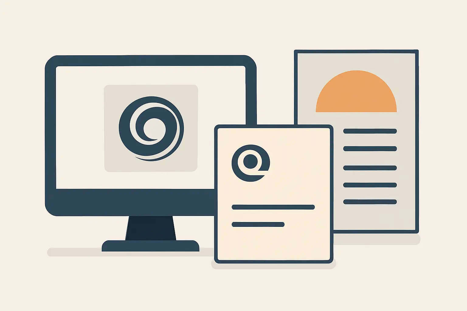
You can tell when a business is losing sales before the first conversation. The logo looks one way on the storefront, the business card uses a different color, and the flyer feels like it belongs to another company entirely. Customers might not say why they hesitate – they just hesitate.
A well-built branding package that includes a logo, business card, and flyer fixes that gap quickly because it covers the three touchpoints most small businesses rely on: recognition, referrals, and promotions. Done right, it is not “pretty design.” It is operational clarity that shows up everywhere your customer makes a decision.
Why a branding package beats one-off design
When you buy a logo alone, you are buying a symbol. When you buy a logo plus supporting collateral, you are buying a system. That system keeps your brand consistent even when you are moving fast – printing cards on short notice, running a seasonal promo, adding a new team member, or swapping vendors.
Consistency is not about being rigid. It is about reducing friction. A customer should not have to re-learn who you are each time they see you.
There is a trade-off: packages require a bit more upfront coordination. But the payoff is you stop paying “rebuild” costs later. Most businesses spend more money fixing inconsistent design than they would have spent building a simple, cohesive set from the start.
The core: branding package logo card flyer
If you search for “branding package logo card flyer,” you are usually looking for one thing: a clean, professional set of assets you can use immediately, without guessing at sizes, files, or print details.
Here is what that package should cover in practical terms.
1) Logo files that are actually usable
A logo is only as helpful as the file types you receive. For most small businesses, you need versions that work across print, web, and signage, plus variants that handle different backgrounds.
You should expect a primary logo, a simplified option (often a mark or icon), and a text-only version for tight spaces. You should also receive color and black-and-white versions so you are not improvising when a printer, embroiderer, or sign shop asks for something specific.
On file types, it depends on how you will use the logo. If you are doing any printing at all, you need vector files so the logo stays sharp at any size. For digital use, you need web-ready formats sized for common placements.
A practical deliverable set typically includes vector (AI, EPS, or SVG) plus high-resolution PNG and JPG. If your designer only gives you a PNG, you are set up for limits later.
2) Business card design that supports real-life networking
Business cards still matter because they create a clean handoff in the moments when people are ready to follow up. The card is not there to impress a designer. It is there to make the next step easy.
Good card design is built around:
- Clear name and role hierarchy (so the reader knows who you are in one glance)
- A phone number and email that are readable at arm’s length
- A website or booking link that is short enough to type
- Optional elements that match the business model, like a service area, license number, or QR code
The trade-off with QR codes is that they can clutter a card if they are too large or shoved into a corner without spacing. If you use one, it should be intentional: a clean path to a booking page, menu, reviews, or inquiry form.
Print setup matters too. Your card should be delivered with correct bleed and safe margins, and in a file format printers accept without changes. If you have ever had a printer “adjust” your file, you know how quickly that can go sideways.
3) Flyer design that is built to convert, not decorate
Flyers are where many brands fall apart, because promotions create urgency. Someone needs a flyer for an event this weekend, a new listing, a seasonal special, or a limited-time offer – and they grab a template that does not match anything else.
A flyer that performs does three jobs:
First, it grabs attention with a clear headline that matches what your customer actually wants (not internal jargon). Second, it provides a fast scan path: what it is, who it is for, where it is, when it is, and how to act. Third, it creates credibility through consistent branding: logo placement, brand colors, typography, and photo style.
It depends on distribution. A flyer for a front desk or counter can hold more detail because the reader is already in your space. A flyer for door drops or community boards should prioritize one message and one action because attention is lower.
From a deliverables standpoint, you want print-ready PDF files with proper bleed, plus an editable source file if you plan to run frequent promotions. If you will share the flyer digitally, you also want a web-optimized version that loads fast and looks good on mobile.
What “consistent” actually means (and what it does not)
Consistency does not mean every piece looks identical. It means every piece feels like the same business made it on purpose.
That comes down to a few practical standards:
- A defined color palette with usable values for print and screen
- A small, controlled set of fonts with rules for headings and body text
- A repeatable layout logic for spacing, alignment, and hierarchy
- Image choices that match the brand tone (clean and bright vs. moody and premium, for example)
If your logo is modern but your flyer uses clip-art icons and three random fonts, the customer’s brain flags it as risk. The goal of a package is to remove that risk signal.
A process that keeps the package fast and low-risk
A package only works if the process is structured. Otherwise, you lose time in endless “opinions,” and you still end up with mismatched pieces.
A reliable workflow usually looks like this.
Discovery that stays practical
You do not need a 40-page brand manifesto to get a strong logo, card, and flyer. You do need clarity on your offer, your audience, and how people buy.
The most productive inputs are simple: what you sell, who you sell to, your price positioning (budget, mid-market, premium), and where the brand will show up first (storefront, property signage, vehicle, Instagram, local mailers).
Design rounds with controlled feedback
Speed comes from time-boxed revisions and clear checkpoints. If five stakeholders give conflicting feedback at random times, the work slows and quality drops.
The practical approach is to choose one decision-maker and collect internal feedback before sending it to the designer. You move faster and you avoid “design by committee.”
Deliverables packaged for real-world use
The handoff should be clean: organized files, clear naming, and formats that match how you will use them. If you have to ask, “Which file do I send the printer?” the package is not complete.
This is also where milestone-based payments can make sense. You reduce risk because you are approving work in stages, and the designer stays accountable to tangible deliverables.
Common mistakes that cost time and credibility
Most branding problems do not come from bad taste. They come from missing constraints.
One common mistake is designing the logo without thinking about the smallest use case. If your logo has fine lines and tiny text, it will fail on business cards, social profile icons, and certain print applications.
Another is choosing colors that look great on screen but print inconsistently, especially neon tones or extremely dark backgrounds. It is fixable, but it is better to plan for print from the beginning.
A third is treating the flyer as a separate project with separate fonts and styles. Flyers are promotional, yes, but they still have to look like the same company that hands out the card and answers the phone.
When to keep it simple – and when to scale up
A branding package is a starting point, not a ceiling.
If you are a new local service provider, a clean logo, a strong card, and a repeatable flyer template may be enough to start booking work immediately. You can add pieces as demand grows.
If you are in hospitality or property, you may need more sooner: signage, menus, welcome booklets, listing templates, and photography that matches the brand tone. That is when the “system” matters even more, because you are producing materials regularly.
If your business has multiple locations or teams, it may be time to add a simple brand guide so vendors and staff can keep things consistent without asking you every time.
If you want a structured, budget-smart way to build these assets without agency complexity, Brandcrafter.co.nz frames its work around a clear method and modular deliverables so you can start with the essentials and scale into a full rollout.
How to judge whether your package is working
You do not need to guess. A package is doing its job if:
Customers recognize your brand faster over repeat exposures, referrals feel smoother because the card is clear and credible, and promotions get responses without requiring you to explain basic details.
Internally, you will feel it too. You will stop hunting for files, stop re-formatting designs for printers, and stop re-litigating colors and fonts every time you need a new piece.
A practical branding package is not a trophy. It is a tool that reduces friction, protects your credibility, and helps you show up like a business that is here to stay.
If you are deciding where to start, start where your customer touches you most often: the logo they recognize, the card they keep, and the flyer that gives them a reason to act. Then keep building, one consistent piece at a time.