
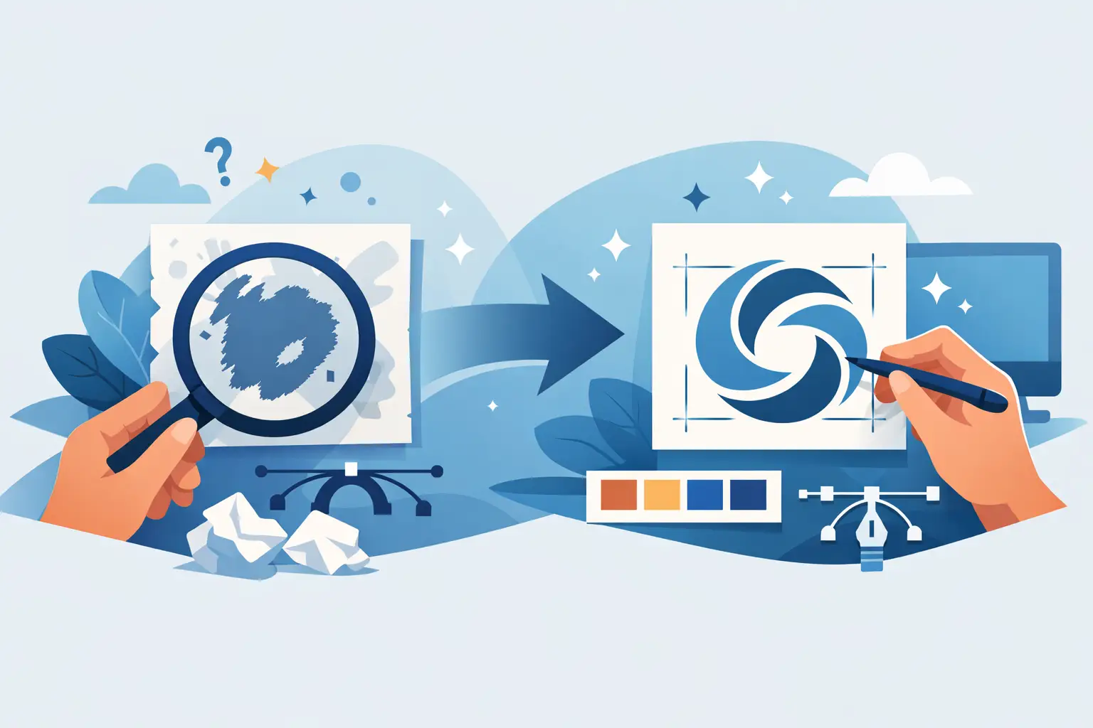
A logo can look acceptable on a phone screen and still fail where business happens: on a storefront sign, vehicle decal, business card, invoice, social profile, or promotional flyer. A before after logo cleanup example makes the difference visible. The goal is not to make a familiar mark unrecognizable. It is to remove the small flaws that make a business look less established than it is.
For local service providers, hospitality operators, property businesses, and growing teams, logo cleanup is often the practical middle ground between keeping an existing identity and paying for a complete rebrand. Done well, it protects recognition while making the logo easier to use, reproduce, and trust.
What a Before After Logo Cleanup Example Actually Shows
The “before” logo is rarely a total disaster. More often, it is a file that was created quickly, copied from an old document, supplied only as a low-resolution image, or altered repeatedly over time. The business may have used it successfully for years, but each new application exposes another limitation.
The “after” version should look more controlled, not merely more decorative. Letterforms align properly. Curves are smooth. Gaps between elements feel intentional. Colors are consistent. Fine details have been tested at small sizes. Most importantly, the logo is supplied in formats that work across print and digital marketing.
A cleanup is successful when customers recognize the same business, yet the business presents with more confidence. It is the visual equivalent of arriving in a clean, well-maintained work vehicle with clear signage instead of a vehicle with a faded, crooked decal.
The Most Common Problems in the Before Version
Pixelated or unsuitable source files
Many businesses only have a JPEG, PNG, screenshot, or image pulled from an old social media profile. These files may look fine at a small size but become blurry when enlarged for signs, banners, uniforms, or print. A designer cannot create crisp large-format artwork by simply stretching a small image.
Logo cleanup usually involves rebuilding the artwork as vector graphics. Vector files use points and paths rather than fixed pixels, so they can scale cleanly from a tiny website icon to large-format signage. This is one of the most valuable parts of the work because it gives the business a usable master file rather than another temporary workaround.
Uneven spacing and weak alignment
Small spacing problems create a big impression. A symbol sitting slightly too close to the business name, letters that do not share a consistent baseline, or uneven gaps inside an icon can make a logo feel improvised.
During cleanup, designers adjust optical spacing rather than relying only on measurements. Two gaps can be mathematically equal but look different because of letter shapes, angles, or color contrast. The final logo needs to feel balanced at a glance, especially on fast-moving marketing pieces such as flyers, social posts, and vehicle graphics.
Inconsistent type and hand-built lettering
A previous logo may use an outdated font, mixed font styles, distorted text, or lettering that has been modified without enough care. This can make the name difficult to read and almost impossible to reproduce consistently.
The right fix depends on the brand. Sometimes the best choice is to redraw the lettering so it is clean and unique. In other cases, selecting a more practical type treatment preserves the original personality while improving legibility. A cleanup should never force a trendy font onto a business that needs a straightforward, trustworthy identity.
Colors that do not reproduce reliably
A bright color on screen may print duller than expected. A logo that relies on gradients, shadows, or several similar colors may also become difficult to read in one-color applications, embroidery, stamps, and small-format printing.
Cleanup establishes reliable color values for digital and print use. It also creates simple color variations: full color, one color, black, and reversed white. That preparation prevents expensive decisions later, when a printer, signwriter, or promotional supplier asks for artwork that works on a specific material.
What Changes in a Professional Logo Cleanup
The strongest cleanups follow a clear sequence. First, the existing mark is reviewed for what should stay: recognizable shapes, the business name, key colors, or an icon customers already associate with the company. Next, the artwork is rebuilt and refined. Finally, it is tested in the places where the business actually uses it.
This practical testing matters. A detailed logo can look attractive in a presentation but disappear on a business card. A very horizontal logo may work beautifully on a website header but create awkward empty space on a square social profile. Rather than producing one file and hoping it fits every situation, a professional cleanup often includes sensible logo variations.
A typical final package should include a primary logo, a stacked or alternate layout where needed, a simple icon or mark for compact uses, and versions for light and dark backgrounds. File delivery should cover vector formats such as AI, EPS, or SVG, plus high-resolution PDF and PNG files for common day-to-day use. Exact formats depend on the client’s needs, but the principle is simple: the business should not need to recreate its logo every time a new marketing opportunity appears.
Cleanup vs. Redesign: Choosing the Right Level of Change
Not every old logo needs a complete redesign. If customers know the name and symbol, if the business has established signage or uniforms, and if the basic concept still fits the company, cleanup can deliver a strong return with less disruption. It improves professionalism while maintaining continuity.
A redesign becomes more appropriate when the logo no longer reflects the business, targets the wrong audience, is hard to read even after refinement, or creates legal and practical issues because it is too similar to another brand. It can also be the right call after a major service expansion, ownership change, or repositioning.
There is a trade-off. A light cleanup is faster and usually more cost-conscious, but it cannot solve a weak underlying concept. A full redesign gives more strategic freedom, but requires more decisions, more feedback, and a plan for rolling out the new identity. The right choice starts with an honest review of where the current logo is helping and where it is holding the business back.
How the 3P Method Keeps Cleanup on Track
A logo cleanup should not feel like open-ended design guesswork. Brandcrafter uses a 3P Method – Personal, Practical, Professional – to keep the process focused on the business and its real-world needs.
Personal means understanding what existing customers recognize and what the owner wants to protect. Practical means designing for the actual touchpoints: cards, flyers, uniforms, signage, websites, and ongoing promotions. Professional means delivering refined artwork, defined revisions, and production-ready files that outside suppliers can use without confusion.
The best collaboration is specific. Instead of saying a logo should look “more modern,” identify the outcome: easier to read from a distance, more credible for commercial clients, clearer on a business card, or consistent across multiple staff vehicles. Those goals give feedback a useful direction and prevent rounds of changes based only on personal preference.
Questions to Ask Before Approving the After Version
Before sign-off, view the logo at several sizes and in several contexts. Check whether the business name remains readable when small. Ask whether the icon still works without the full name. Confirm that the logo performs on both white and dark backgrounds, and that the supplied files are clearly named and organized.
It is also worth checking ownership and access. Your business should know where the final master files are stored and which versions to send to printers, web developers, and promotional suppliers. A polished logo is only useful if your team can confidently put it to work.
The right before-and-after result is not about adding visual noise. It is about creating a logo that looks intentional wherever customers meet your business, from the first online search to the card they keep in their wallet.