
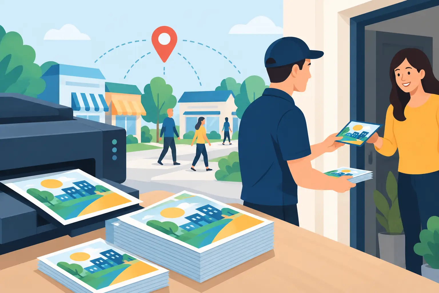
A flyer has only a few seconds to earn attention – whether it is handed over a counter, displayed in a lobby, or delivered to a mailbox. That is why flyer printing services should be treated as more than a final production step. The paper, size, finish, message, and distribution plan all affect whether your promotion brings in calls, bookings, foot traffic, or sales.
For local businesses, a flyer is often one of the fastest ways to put a clear offer in front of the right people. But speed only works when the piece is designed to be understood quickly and printed to match the job it needs to do.
Start With One Clear Business Outcome
Before choosing stock or requesting a quote, decide what success looks like. A restaurant may need more weekday reservations. A property manager may need tenant inquiries. A service business may need estimates booked before a seasonal rush. A new business may simply need local awareness and a professional first impression.
That objective determines the structure of the flyer. Trying to promote every service, every special, and every business advantage at once usually creates a crowded page with no clear next step. A better approach is to lead with one offer or message, support it with the most relevant proof, and make action simple.
For example, a lawn care company could lead with a seasonal cleanup offer, followed by a short service area statement, a before-and-after image, and a phone number. A hospitality venue could promote a private event package with capacity details, a strong venue photo, and a booking deadline. Both need a different message, but each needs a single job.
What Effective Flyer Printing Services Include
The best flyer printing services connect design decisions with production requirements. A printer can reproduce a file accurately, but it cannot fix an unclear hierarchy, a weak offer, or a low-resolution image after the job has gone to press.
A well-managed flyer project should account for the core production details from the beginning:
- Final size and orientation, such as 8.5 x 11 inches, 5.5 x 8.5 inches, or a square format
- Single-sided or double-sided layout
- Paper weight, coating, and finish
- Bleed, trim area, and safe margins
- Print quantity and whether the campaign will be repeated
- Delivery timing and how flyers will be distributed
These choices are connected. A glossy finish can make food, retail, or event photography feel more vivid, while an uncoated stock can suit a professional service business that wants customers to write notes or appointment details on the piece. A heavier card stock feels more premium at a trade show or reception desk, but it may not be necessary for a high-volume door-drop campaign.
The practical question is not which option is objectively best. It is which option supports the campaign without spending budget where it will not create a better response.
Design for the Distance and the Decision
Most flyers are not read from top to bottom. People scan them. They notice the headline, image, color, offer, and call to action before deciding whether the details deserve their time.
Your main headline should answer a customer question quickly. It might identify a problem, introduce a limited promotion, or point to a useful result. Statements such as “Book Your Holiday Party,” “Get Your Free Roofing Estimate,” or “Move-In Specials This Month” give the reader an immediate reason to keep looking.
The supporting copy should then remove friction. State what is included, who it is for, where it applies, and any deadline or conditions. Keep contact details highly visible. If a customer must hunt for your phone number, website, location, or booking instruction, the flyer has created unnecessary work.
Visual hierarchy matters as much as copy. Use a clear reading order: headline first, offer second, proof or key details third, and action last. This is particularly important when flyers are displayed alongside competing messages on a counter, bulletin board, or community notice area.
A professional logo, consistent colors, and readable typography also do more than make a flyer look polished. They signal that the business is established and dependable. For businesses building their identity, a flyer should use the same visual system as business cards, signage, social posts, and website materials. Repetition builds recognition.
Choose Paper and Finish Based on Use
Paper is a functional decision, not just a cosmetic one. Consider where the flyer will be seen, how long it needs to last, and whether someone needs to keep it.
For short-term promotions, standard text-weight paper can be cost-effective and easy to distribute at scale. It works well for community drops, event announcements, and time-sensitive offers. For menus, service packages, real estate handouts, and counter displays, a thicker stock often creates a more considered impression and holds up better through repeated handling.
Finish affects both appearance and practicality. Gloss coating is often a strong match for image-led promotions because it adds contrast and color intensity. Matte or uncoated paper can feel more understated and may be easier to write on. If your flyer includes a coupon, appointment reminder, or quote field, that small detail can influence the right finish.
Ask for a physical proof or paper sample when the campaign depends heavily on texture, photography, or brand color. Screens are useful for reviewing layout, but they do not accurately show how a deep navy, soft gray, or bright red will appear on a chosen stock.
Prepare Print Files Correctly
Production-ready files prevent delays, surprise charges, and disappointing results. A professional design file for print is not the same as an image pulled from a website or social media post.
Your final artwork should generally be built at high resolution, use a print-ready color setup, and include bleed beyond the trim edge. Text and critical logos need to stay inside a safe margin so they are not cut too close during trimming. Images must be large enough for the intended print size. Enlarging a small online image may look acceptable on screen, then appear soft or pixelated in print.
If your flyer includes QR codes, test them from a printed proof using more than one phone. Give the code breathing room, avoid placing it over a busy image, and pair it with a clear instruction such as “Scan to book” or “View the full menu.” A QR code without a reason to scan is easy to ignore.
At Brandcrafter, this is where a process-led approach protects the outcome. The 3P Method – Personal, Practical, Professional – keeps feedback focused on the message, layout, and production details before files are finalized. Clear checkpoints reduce last-minute changes and help ensure the approved design is ready for the printer, not just attractive in a presentation.
Match Quantity to Distribution
Ordering more can lower the unit price, but the cheapest unit cost is not always the best campaign decision. A large run only makes sense if you have a realistic plan to distribute it while the offer is still relevant.
Start with your audience and location. A local service provider may see better results from a targeted neighborhood campaign than a broad run across areas outside the service radius. A cafe may benefit from smaller, regularly refreshed batches that keep seasonal offers current. A property operator may need enough volume for leasing appointments, local businesses, and open-house events over several weeks.
Build a simple tracking method into the flyer. Use a campaign-specific offer code, dedicated phone extension, QR code, or landing-page message. You do not need complex reporting to learn what worked. You need a way to connect inquiries and sales back to the printed piece.
Review Before You Approve
The final review is where costly mistakes are avoided. Read every word aloud, including phone numbers, addresses, dates, prices, and disclaimers. Confirm that the offer is still valid and that staff know how to handle responses. Check that logos are current and that the call to action matches the destination, especially if the flyer directs people to a booking page or form.
Then view the design at actual size. A headline that feels large on a monitor can become less noticeable once printed. Fine text, light color contrast, and tightly packed details are easier to catch when reviewing a true-scale proof.
A good flyer does not need to say everything about your business. It needs to give the right customer a confident reason to take the next step. When design, print choices, and distribution work together, a simple printed piece can become one of your most reliable local marketing tools.