
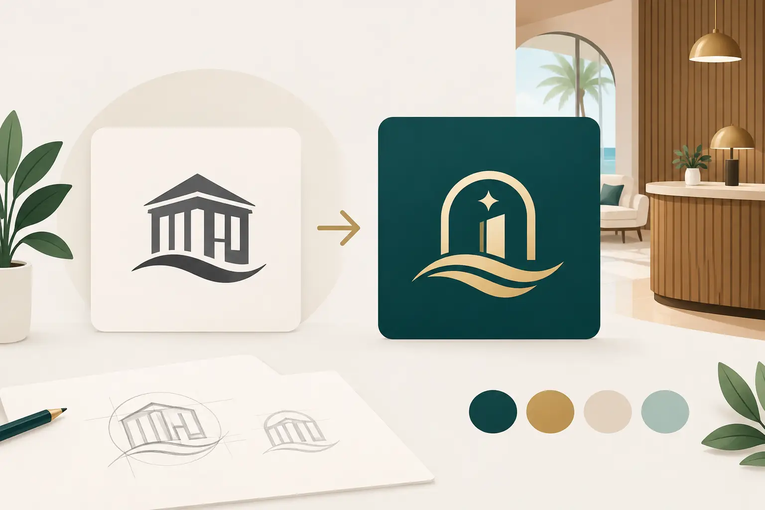
A guest can form an opinion of your property before they reach the front desk. Your logo appears on booking pages, roadside signs, menus, room keys, review responses, social posts, uniforms, and invoices. A logo redesign for hospitality business owners is therefore not a cosmetic exercise. It is a commercial decision about whether every guest-facing detail still communicates the experience you promise.
For a boutique hotel, café, restaurant group, motel, lodge, or short-stay operator, the right redesign improves recognition without throwing away hard-won trust. The wrong one creates confusion, looks expensive to implement, and leaves your team using a patchwork of old and new materials. A practical process keeps the project focused on guest confidence, operational reality, and a brand system your business can actually maintain.
Know whether you need a refresh or a full redesign
Not every older logo needs to be replaced. Sometimes the name carries local recognition, the shape works well on signage, and the issue is simply dated typography, a poor-quality digital file, or colors that do not reproduce consistently. In that case, a refinement can preserve familiarity while making the identity sharper and more flexible.
A full redesign is more appropriate when the business has changed in a meaningful way. Perhaps a motel has been renovated into a design-led stay, a restaurant has expanded into events and catering, or a property group now operates multiple locations. If the current logo attracts the wrong type of guest, feels inconsistent with your pricing, or cannot work clearly at small digital sizes, a more substantial change may be justified.
The trade-off is recognition. A recognizable but imperfect mark can be more valuable than a fashionable logo that existing guests no longer connect with. Before approving a new direction, identify the visual assets worth retaining. That might be a familiar symbol, a signature color, the property name, or a local reference that guests already remember.
Start with the guest experience, not design preferences
Hospitality brands are judged through moments: finding the entrance after dark, scanning a menu quickly, checking in after a long trip, or deciding whether a venue looks credible enough for a celebration. Your logo needs to support those moments rather than compete with them.
Begin by defining the business you are asking guests to choose. A family-friendly coastal motel needs a different visual signal from an intimate wine bar or a premium urban apartment stay. Consider your strongest source of revenue, the guests you want more of, the level of service you deliver, and the price point you need the brand to support.
This is also where practical feedback matters. Owners, managers, front-of-house staff, and repeat guests can each reveal a different issue. A manager may know that the current logo is unreadable on uniforms. A guest may say the booking page looks less polished than the rooms. Neither insight is a matter of personal taste. Both affect trust and conversion.
Build a clear redesign brief
A useful brief gives the design process a target. It should state why the redesign is happening, what must remain recognizable, where the logo will be used, and what success looks like after launch. “Make it modern” is not enough. “Help us look credible for corporate functions while remaining approachable for local diners” gives the project direction.
Include the non-negotiables early. If your property uses heritage building signage, has a difficult-to-change exterior color, or relies on a well-known name, those constraints should shape the concept from the first round. Late surprises slow the project and can push a good-looking design into a costly rollout.
Design for the places guests actually see it
A hospitality logo must work harder than a logo that only lives on a website. It needs to remain clear from across a parking lot, on a small mobile screen, on a printed receipt, and in a profile image. That requires a design system, not just one attractive logo file.
Ask to see proposed concepts in realistic applications. A polished presentation on a white background does not prove that a mark will work on a linen napkin, a dark shopfront, a takeaway cup, or a booking confirmation email. Mockups are useful because they reveal issues with contrast, legibility, scale, and visual hierarchy before money is spent on production.
Typography deserves the same attention as the symbol. Decorative lettering may suit a high-end venue name on signage, but it can become difficult to read in map listings or social profile headers. Many hospitality brands benefit from a primary logo supported by a simpler alternate version for small spaces.
Color choices also need an operational check. A muted palette may create the right mood, yet fail on low-light signage or print inconsistently across suppliers. Strong brand color is not just a preference. It is a repeatable instruction for every menu printer, staff member, photographer, and marketing partner.
A practical logo redesign for hospitality business operations
The redesign becomes valuable when it reduces inconsistency across the business. That means planning the rollout at the same time as the logo, rather than treating implementation as an afterthought.
Start with your highest-visibility touchpoints: website and booking channels, exterior signage, menus, social media profiles, email signatures, and staff-facing templates. Then prioritize replacement items based on cost, stock levels, and urgency. There is no need to discard every printed item overnight if the old logo is still accurate and presentable. A staged rollout can protect cash flow, especially for independent operators.
Your final handover should include the files and rules needed to keep production consistent. At minimum, request:
- Primary, alternate, and icon-only logo versions
- Vector files for signage and professional print production
- Web-ready files for websites, booking platforms, and social channels
- Color specifications for print and digital use
- A simple brand guide covering spacing, minimum size, background use, and approved colors
If the redesign includes business cards, flyers, menu inserts, or promotional templates, make sure those items are built from the same visual rules. This is where a modular approach pays off. You can launch with the essential logo assets, then extend the identity as seasonal promotions, events, or new locations require it.
Keep decisions fast, but not rushed
Speed matters in hospitality. You may be preparing for a reopening, a busy season, a new lease, or a change in ownership. But speed without a decision process can lead to endless feedback, contradictory opinions, and revisions that dilute the strongest idea.
Use a defined review group and clear checkpoints. Decide who has final approval before concepts are presented. Gather feedback against the brief, not against individual preferences. Questions such as “Does this feel welcoming?” are helpful, but questions such as “Can a first-time guest read this from the street?” lead to better decisions.
A structured process like Brandcrafter’s 3P Method keeps the work personal, practical, and professional. Personal means the brand reflects the character of your venue rather than a generic hospitality trend. Practical means the logo is tested against real applications and budgets. Professional means files, approvals, and production details are managed in a way your team can rely on.
Revision rounds work best when they have a purpose. The first round should establish the right strategic direction. The next should refine typography, color, and proportions. The final stage should focus on production readiness, not reopening the entire concept. This gives you room to collaborate while protecting timeline and budget.
Measure the redesign beyond compliments
A new logo should look better, but visual approval is only the starting point. Watch for practical signals after launch: more consistent use across channels, fewer requests for logo files, clearer signage, stronger engagement on announcements, and feedback that the business now matches the quality guests expect on arrival.
For businesses changing market position, track the indicators tied to that goal. A restaurant seeking more private events might monitor inquiry quality. A hotel improving its direct-booking presence might look at website behavior and booking conversion. Branding does not act alone, but it gives every marketing message a more credible place to land.
The best redesign does not ask guests to work out who you are. It makes the promise of your hospitality feel clear before the welcome begins.