
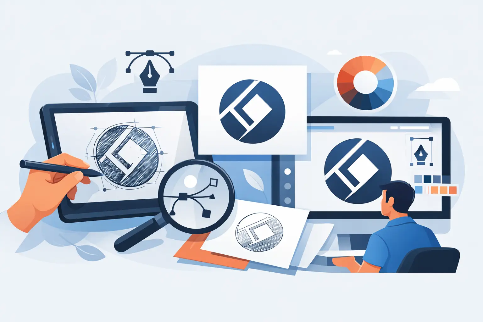
A logo can look perfectly acceptable on an old business card and fall apart the moment it is needed for a vehicle wrap, storefront sign, uniform, or website header. A professional logo redraw service solves that problem by rebuilding your artwork as clean, scalable files that work wherever your business needs to show up.
For many established businesses, the issue is not a lack of brand recognition. It is a lack of usable source files. You may have a JPG pulled from an email, a low-resolution PNG from a previous printer, or a scanned copy of a card designed years ago. Those files are fine for viewing, but they are not production-ready. Redrawing the logo gives you a reliable foundation for every future marketing asset.
What a Professional Logo Redraw Service Actually Does
A logo redraw is not simply tracing a blurry image and exporting it again. The purpose is to recreate the logo accurately in vector format so it can scale to any size without losing clarity.
Vector artwork is built from editable paths, curves, shapes, and colors rather than fixed pixels. That means the same logo can be used on a small social media icon, an invoice, a brochure, a large banner, or building signage without becoming fuzzy or distorted.
A proper redraw process examines the original artwork closely. The designer rebuilds letterforms, adjusts spacing, refines curves, matches colors, and corrects imperfections that may have been hidden in the old file. If the original logo contains a custom icon or symbol, it is reconstructed rather than copied as a rough outline.
The result should preserve the identity customers recognize while giving your business files that printers, sign makers, web developers, and marketing teams can use with confidence.
Signs Your Logo Needs to Be Redrawn
Not every old logo needs a full redesign. If the visual identity still represents your business and customers recognize it, a redraw is often the smarter, more cost-effective move. It retains your existing equity while removing the technical limitations holding the brand back.
You likely need a redraw if your only file is a screenshot, scanned document, photo, low-quality JPG, or blurry PNG. You may also need one if a printer has asked for an AI, EPS, SVG, or PDF file and you cannot provide it.
Other warning signs include rough edges around the logo, colors that print differently from one supplier to another, text that cannot be edited, or a design that becomes unreadable when enlarged. These problems tend to surface at the worst time, usually when a campaign, opening, event, or signage deadline is already close.
A redraw is particularly useful for property operators, hospitality businesses, trades, and local service providers. These businesses often use their logo across a wide mix of surfaces: service vehicles, site boards, menus, uniforms, flyers, loyalty cards, window decals, invoices, and digital promotions. One weak source file can create inconsistency across all of them.
Redraw Versus Redesign: Know the Difference
A logo redraw and a logo redesign solve different problems.
A redraw keeps the core identity intact. The goal is accuracy, clean production files, and better usability. The logo may look sharper or more balanced because the artwork has been professionally rebuilt, but it should still feel familiar to your customers.
A redesign changes the identity itself. It may introduce a new typeface, color direction, symbol, layout, or brand positioning. That can be the right choice when a business has changed direction, expanded its market, or outgrown a dated look. It also requires more strategic discussion, because changing a recognized brand has commercial implications.
If you are unsure which route fits, start with the practical question: is the problem how your logo looks, or is it how your logo performs? If it still reflects your business but does not reproduce properly, redraw it. If it no longer reflects your business, consider a refresh or a full redesign.
What You Should Receive After a Logo Redraw
The value of a redraw is not just the cleaned-up logo. It is the ability to use that logo without repeatedly paying someone to convert, resize, or repair it.
A professional handover should include files for print, digital use, and future editing. In most cases, that means an editable vector source file such as AI or EPS, along with a print-ready PDF, SVG for websites and digital applications, and transparent PNG files for everyday use.
You should also receive practical variations of the mark. Depending on the logo, these may include a full-color version, black version, white reverse version, horizontal layout, stacked layout, and icon-only mark. A single logo file rarely works well in every placement. For example, a wide logo may be ideal for a website header but unsuitable for a square social profile or a narrow vertical sign.
Color specifications matter too. Your files should account for RGB color use on screens and CMYK use in print. If brand color consistency is critical, Pantone references may also be useful for uniforms, packaging, signage, or specialty printing.
At Brandcrafter, this type of work is most effective when it is treated as the starting point for a practical brand system, not an isolated file cleanup. A clean logo can then move directly into business cards, flyers, signage, website assets, and ongoing promotional materials without visual drift.
A Clear Redraw Process Reduces Risk
The best redraw projects are collaborative, but they should not be open-ended. Business owners need a clear process that protects accuracy while keeping the project moving.
Start With the Best Available Reference
Send every version of the logo you have, even if the files are poor quality. An old sign photo, previous business card, embroidered uniform, invoice, or social media image can help clarify details that are missing from a single file.
It also helps to explain where the logo will be used next. A logo being prepared for a storefront sign requires a different level of production checking than one needed only for an email signature. Usage informs the file package and avoids gaps later.
Rebuild and Review the Core Artwork
The designer creates the vector artwork, matching the original form as closely as possible. This is where professional judgment matters. Low-resolution references often hide letter spacing, line weight, corner shape, and color details. Those elements need to be resolved carefully rather than guessed at quickly.
A review stage lets you confirm that the logo still feels like yours. Structured feedback works best: identify specific changes, provide one consolidated set of comments, and approve the direction before final files are prepared. This keeps revisions focused and prevents version confusion.
Finalize Files for Real-World Use
Once approved, the artwork is exported and organized for the places it needs to work. Final files should be clearly named so your printer, web developer, or staff can identify the right version without trial and error.
This practical handover is a small detail with a big payoff. It prevents common mistakes such as placing a white logo on a light background, printing an RGB file with unexpected colors, or enlarging a web image for a sign.
Why Cheap Tracing Often Creates More Work
Automated tracing tools and low-cost online services can produce a file that appears to be vector artwork. The problem is that appearance is not the same as quality.
Auto-traced logos often contain too many points, uneven edges, distorted lettering, and awkward curves. They can be difficult for printers and sign makers to work with, especially when cut vinyl, embroidery, engraving, or large-format production is involved. A logo that looks fine on a screen may reveal every flaw when it is enlarged.
The cheapest option can also create ownership and consistency problems. If the provider does not supply editable master files, you may still be dependent on them every time you need a new format. If the redraw uses substitute fonts or inaccurate colors without documenting them, your brand can gradually become inconsistent across different suppliers.
A professional service costs more than a one-click trace because it includes careful reconstruction, a review process, usable file formats, and accountability for the final result. For a logo used across years of marketing, that is a practical investment rather than an unnecessary design expense.
Build From a Clean Foundation
Once your logo is redrawn, treat the new files as a controlled brand asset. Store the master files in one secure location, share the right format with each supplier, and avoid allowing random copies to become the new default version.
If you are planning new cards, flyers, signage, photography, or a website, complete the redraw first. Every asset created afterward will be easier to produce, more consistent to present, and less likely to require expensive corrections at print stage. A clean logo does not just make your brand look sharper. It gives your business a dependable starting point for every customer-facing decision that follows.