
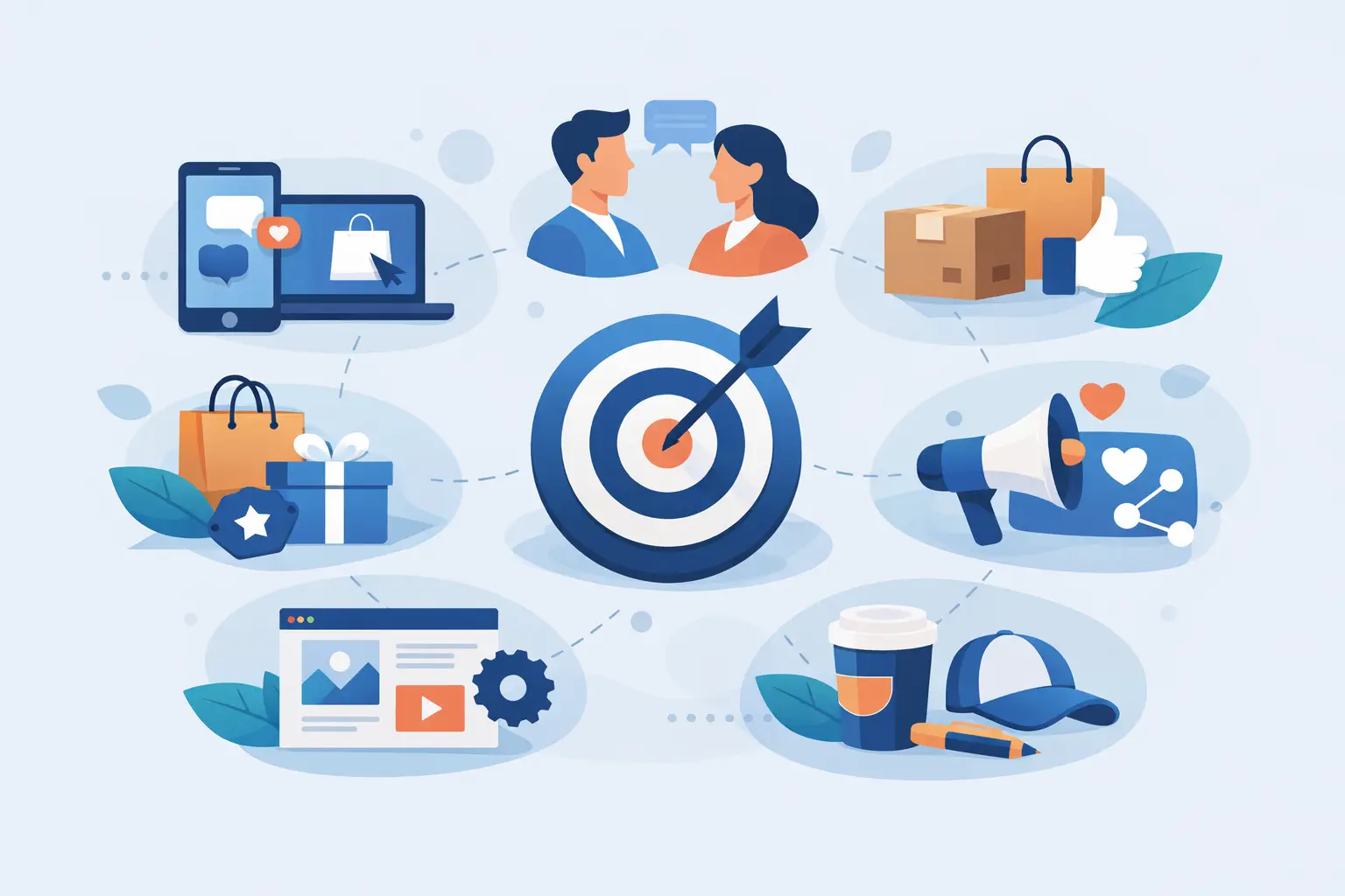
Most startups do not have a branding problem. They have a consistency problem.
A founder spends weeks refining a logo, then sends prospects a plain-text invoice, hands out a forgettable business card, and launches a website that feels like it belongs to a different company. That gap is where trust leaks out. The best brand touchpoints for startups are not the flashiest assets. They are the moments customers actually see, hold, click, and remember when deciding whether your business feels credible.
For a startup, every touchpoint has a job. Some build recognition. Some reduce friction. Some help close a sale. The right mix depends on how you acquire customers, how quickly you need to look established, and what your buyers expect before they say yes. If you are trying to build a brand on a real budget, the goal is not to create everything at once. It is to prioritize the touchpoints that create the strongest first impression and the clearest path to conversion.
What makes a startup brand touchpoint worth investing in
A good touchpoint does more than look polished. It supports a business outcome.
That means it should either help people trust you faster, understand what you offer more clearly, or take the next step with less hesitation. If a touchpoint cannot do one of those jobs, it is probably not urgent in an early-stage rollout.
This is where many startups overspend. They invest in items that feel exciting rather than assets that customers actually interact with in buying moments. A branded tote bag might be nice. A clear website homepage, a strong logo, and a business card your sales team can confidently hand over are usually more useful.
The best brand touchpoints for startups to prioritize first
1. Logo and core brand identity
Your logo is rarely the whole brand, but it is still the anchor. It shows up on almost everything else, which makes it one of the highest-leverage startup assets you can create.
A strong startup logo should be simple, readable, and flexible across print and digital use. It needs to work on a business card, a social profile image, a flyer, a website header, and a quote document without falling apart. Founders often choose based on personal taste alone, but practicality matters just as much. If your mark only works in one layout or one color treatment, you will spend more time fixing inconsistency later.
Your core identity should also include basic rules for color, typography, and logo usage. Not a bloated brand manual. Just enough structure so every future touchpoint looks like it came from the same business.
2. Website homepage and key service pages
For most startups, the website is the first serious credibility check. People may find you through a referral, flyer, Instagram profile, or Google search, but they usually confirm their impression on your site.
That means your homepage needs to do three things fast: tell visitors what you do, show who you help, and make the next step obvious. If someone lands there and still has to work out what kind of business you are, the page is not doing its job.
Key service pages matter just as much. A local service provider, hospitality operator, or property business does not need a huge site to start. But they do need clear pages that explain the offer, support trust with visuals or proof, and give buyers a direct path to contact or book.
3. Business cards
Business cards still matter because real business still happens in person.
Networking events, supplier meetings, local partnerships, site visits, hospitality interactions, and community referrals all create moments where a card can either reinforce your professionalism or undercut it. A well-designed card gives your startup a more established presence, especially when the design matches your logo, website, and printed collateral.
The trade-off is simple. If your startup sells almost entirely online, cards may not be your first asset after a logo. But for local and relationship-driven businesses, they remain one of the best brand touchpoints for startups because they are affordable, practical, and used at the exact moment someone is deciding whether to remember you.
4. Flyers and printed promotional material
Print is often dismissed too quickly by startups that assume everything happens digitally. That is not how many local businesses win customers.
A flyer can work hard when your growth depends on foot traffic, local distribution, property marketing, seasonal promotions, or event exposure. It gives you a controlled message in a physical format that customers can keep, pass on, or act on later. For hospitality, trades, real estate-adjacent services, and local home service businesses, flyers are still a direct response tool.
What matters is not just the design. It is the structure. A flyer should lead with one offer, one audience, and one next action. Too much information weakens it. Too little makes it forgettable.
5. Email signature and everyday documents
This is where startup branding often breaks.
You may have a sharp logo and a clean website, but if your proposals, invoices, email signature, and quote documents look generic, customers experience your brand as unfinished. These everyday operational materials are some of the most frequent touchpoints in the entire customer journey.
A clean email signature, branded quote template, invoice format, and presentation document can do more for perceived professionalism than many founders expect. They reassure buyers that your business is organized. That matters, especially when customers are comparing multiple providers with similar pricing.
6. Social media profile branding
Social media is not equally important for every startup, but profile consistency is still worth getting right.
Even when social platforms are not your main sales channel, people check them. They want signs that your business is active, real, and current. At minimum, your profile image, cover visuals, bio, and post templates should align with the rest of your brand.
This does not mean building a full content machine on day one. It means making sure the touchpoint does not create doubt. A polished but quiet profile is better than a busy, inconsistent one that sends mixed signals.
7. Photography and visual assets
Stock images can fill gaps, but original photography builds trust faster.
If customers are buying a local service, visiting a venue, meeting your team, or comparing your quality with a competitor, real visuals carry weight. They show the business behind the branding. They also make every other touchpoint stronger, from your website and flyers to social posts and brochures.
For some startups, photography can wait until after the initial launch. For others, especially hospitality, property, food, beauty, and service businesses, it should come much earlier because visuals directly affect conversion.
8. Packaging, signage, or in-person environment
If customers experience your brand physically, the environment is a touchpoint too.
That could mean storefront signage, menus, takeaway packaging, appointment cards, vehicle graphics, or reception materials. These are not always first-stage assets, but they become critical once customers start interacting with the business in person. A polished environment tells people the business is established and detail-oriented. A mismatched one creates doubt, even when the service itself is strong.
How startups should choose the right touchpoints first
Start with the buying journey, not the asset wishlist.
Ask where customers first hear about you, where they go to verify credibility, and what they see right before they commit. Those three moments usually reveal your top priorities. If you win business through referrals and face-to-face meetings, your logo, business cards, and quote documents matter early. If people discover you online first, your website and brand identity will carry more weight.
This is also where a process matters. A staged rollout is often smarter than trying to launch every asset at once. Build the essentials first, then expand into the next layer without losing consistency. That approach keeps spending practical while protecting the quality of the brand.
Studios like Brandcrafter often solve this well by packaging the core pieces first – logo, card, and flyer – then extending the system into web and campaign assets as the business grows. That kind of structure reduces rework and helps startups look organized faster.
Common mistakes startups make with brand touchpoints
The biggest mistake is treating each touchpoint like a separate design job.
When a website, flyer, social profile, and business card are created in isolation, the brand starts to feel fragmented. Customers may not be able to explain why, but they notice. Consistency is not about making everything identical. It is about making everything feel connected.
Another mistake is overbuilding too early. Startups do not need every possible asset. They need the right assets, built well, with enough flexibility to scale. That usually means fewer pieces, better executed.
The best startup brands are not necessarily the loudest. They are the clearest. Every touchpoint feels intentional. Every file has a job. Every customer interaction supports the same impression.
If you are building from scratch, focus on the moments that shape trust first. Get those right, and the rest of your brand rollout becomes much easier to organize.