
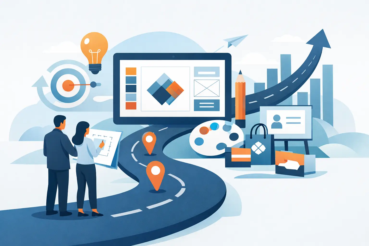
A strong brand usually does not fail because the logo was wrong. It fails because the business never had a clear brand identity design roadmap – one that connects the logo, business cards, flyers, website visuals, and day-to-day marketing into a system people recognize and trust.
For small and midsize businesses, that roadmap matters more than theory. You need branding that looks professional, works across print and digital, and can be rolled out without burning time or budget. That means making the right decisions in the right order, with clear checkpoints and deliverables at each stage.
What a brand identity design roadmap actually does
A brand identity design roadmap is a practical sequence for building a usable brand, not just a nice-looking concept. It helps you move from ideas and assumptions to assets your business can put to work immediately.
That distinction matters. Many businesses spend heavily on the visual front end, then stall when they need social graphics, promo flyers, signage, email headers, or updated cards for the team. Without a roadmap, the brand starts fragmenting fast. Colors shift. Fonts change. Messaging loses consistency. Every new piece gets treated like a one-off job.
A roadmap prevents that drift. It gives you a controlled process for defining the brand, designing the core identity, and applying it to the materials customers actually see.
Start with business reality, not design trends
Before any design work begins, the business needs a clear point of view on three things: who it serves, how it wants to be perceived, and where customers will encounter the brand first.
For a local service provider, trust and clarity may matter more than a highly expressive visual style. For a hospitality venue, atmosphere and emotional pull may carry more weight. For a property-focused business, the identity often needs to signal professionalism, stability, and value at a glance.
This is where many rebrands go off track. The owner chases a style they like personally, but the market reads the business differently. A good roadmap keeps the project anchored to commercial use. It asks practical questions early. Will this logo work on a storefront sign? Will it reproduce well on a flyer? Will the typography still feel clear on a business card? Can the brand stretch to a website and social posts later without needing a reset?
If the answer is no, the design is not ready, no matter how polished the mockup looks.
Stage 1: Define the foundation
The first stage of a brand identity design roadmap is strategy in plain English. Not a hundred-slide brand document. Just enough clarity to guide decisions and reduce revision loops.
This foundation usually includes your business position, target customer, tone of voice, core differentiators, and visual direction. It should also identify your immediate rollout needs. Some businesses need a logo, card, and flyer first because they are launching locally and need materials in hand quickly. Others may need website visuals or photography support because digital presence is the priority.
The key is sequencing. You do not need every possible asset on day one. You need the right core assets first, built in a way that supports growth later.
That is where a process-led studio approach helps. Brandcrafter’s 3P Method – Personal, Practical, Professional – reflects the right mindset here. The brand should feel tailored to the business, realistic for actual use, and polished enough to compete from the start.
Stage 2: Build the core identity system
Once the strategic direction is set, the next step is the core visual identity. This is bigger than a logo alone, even though the logo is often the centerpiece.
A reliable identity system includes the primary logo, alternate logo versions, color palette, typography choices, spacing behavior, and basic usage rules. In many cases, it should also include social profile-friendly logo crops, simple icon treatments, and print-ready file variations.
The reason this stage matters is straightforward. Businesses rarely use one version of a logo in one place. They need it on dark backgrounds, light backgrounds, narrow spaces, square spaces, and quick-turn promotional pieces. If the identity is too fragile or too complicated, the brand becomes hard to use well.
There is also a trade-off here. A highly detailed visual concept can look impressive in presentation, but it may slow production or create inconsistency across everyday materials. On the other hand, an identity that is too stripped back can feel generic. The right answer depends on where the business shows up most and how quickly its marketing needs to move.
Stage 3: Apply the brand to real customer touchpoints
This is the stage many businesses underestimate. A brand becomes credible when it shows up consistently in the materials customers actually handle, see, and remember.
For many small businesses, the first rollout should cover three practical touchpoints: business card design, flyer design, and basic digital graphics. Those assets do real work. A card supports direct networking and sales meetings. A flyer helps promote offers, services, events, or openings. Digital visuals create continuity between print and online presence.
Applying the identity early helps expose weak points before the brand expands further. You might learn that your chosen typeface is too light for print. You may find that the color palette needs better contrast. You may realize the logo mark works well on a website header but struggles in smaller ad placements.
That is not failure. That is exactly why the roadmap exists. Controlled application reveals what needs refining while the system is still manageable.
Stage 4: Lock in deliverables and file formats
A professional brand rollout is not finished when the designs are approved. It is finished when the business has the correct files to use the brand properly.
This is where process creates confidence. Clients should know what they are receiving, what each file is for, and how those files support future marketing. At a minimum, the core package should usually include vector logo files, PNG exports with transparent backgrounds, print-ready PDFs, web-friendly versions, and font or style references where appropriate.
If cards and flyers are part of the rollout, those files should be prepared for production, not left as unfinished concepts. That means correct dimensions, bleed settings, export standards, and a clean approval path before print.
This level of detail may sound operational, but it protects the brand. It also protects the client from repeat costs and production delays later.
Stage 5: Create a rollout plan that matches budget and pace
Not every business needs a full-scale identity launch all at once. In fact, staged development is often the smarter route.
A startup may begin with a logo kit, business card, and flyer, then expand into photography, website design, signage, and campaign assets once revenue starts moving. An established business refreshing its image may prioritize updating high-visibility materials first, then transition lower-priority assets over time.
This is one of the most practical parts of a brand identity design roadmap. It gives the business a way to move forward without overcommitting. You can phase the work, protect consistency, and still maintain momentum.
The trade-off is simple. A phased rollout is easier on cash flow, but it requires good file management and clear brand rules to avoid drift between stages. A full rollout creates faster consistency, but it demands more upfront investment and decision-making. Neither approach is automatically better. The right choice depends on urgency, budget, and how many customer touchpoints are already active.
Common mistakes that slow brand progress
The most common problem is trying to solve branding and marketing at the same time with no sequence. The result is often rushed design, too many opinions, and endless revisions because no one agreed on the brand foundation first.
Another mistake is approving a logo before testing it in context. If the identity has not been seen on a card, flyer, website header, and social graphic, you are still working in theory.
A third issue is unclear feedback. Fast projects need structured collaboration. That means defined revision rounds, decision checkpoints, and a single approval path where possible. When feedback is scattered, timelines stretch and costs rise.
The strongest branding projects usually feel calm, not chaotic. Everyone knows the next step, the expected deliverables, and what approval means.
How to know your roadmap is working
A good roadmap produces visible consistency and easier marketing execution. Your materials start to look like they belong to the same business. New assets take less time to produce. Staff and suppliers have fewer questions. Customers recognize your brand faster.
You should also notice better internal decision-making. Once the identity system is clear, you stop reinventing the brand every time a new promotion comes up. That alone saves time and reduces creative waste.
Most importantly, the brand starts supporting growth instead of slowing it down. You are not chasing design for its own sake. You are building a dependable visual system that helps your business show up professionally at every stage.
The best roadmap is not the most complicated one. It is the one that gives you a clear starting point, practical deliverables, and enough structure to grow without losing consistency. If your next brand decision makes future marketing easier, you are on the right path.