
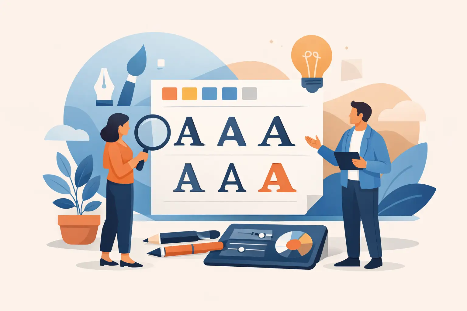
If your logo looks polished but your flyer, website, and business card all feel slightly different, your fonts are often the reason. Knowing how to choose brand fonts is less about personal taste and more about making sure every customer touchpoint feels consistent, readable, and credible.
For small and mid-sized businesses, font decisions carry real weight. A property manager needs to look dependable. A hospitality brand needs to feel inviting. A local service business needs to look clear, professional, and easy to trust. The right font system helps customers understand who you are before they read a single line of copy.
Why font choice matters more than most businesses expect
Fonts shape first impressions fast. They influence whether your brand feels modern or dated, premium or practical, formal or approachable. That effect is subtle, but it shows up everywhere – from signage and printed flyers to social graphics and quote documents.
Good font choices also reduce friction. If customers can scan your service list quickly, read your contact details clearly, and recognize your brand across channels, your design is doing its job. If your headings are hard to read or your font pairing feels inconsistent, the brand starts to lose authority.
That is why font selection should be treated like a business decision, not a decorative one. A strong brand font system supports recognition, consistency, and day-to-day usability.
How to choose brand fonts with a practical framework
The easiest way to make a smart decision is to work through a short filter. Instead of asking, “What font do I like?” ask what the font needs to do.
Start with brand fit. A law office, boutique hotel, electrician, and cafe should not all sound the same visually. Fonts carry tone. Serif fonts often feel established and trustworthy. Sans serif fonts usually feel clean, modern, and direct. Script fonts can add personality, but they are rarely strong enough to carry an entire business identity on their own.
Next, look at readability. A font might look great in a logo mockup and fail completely on a flyer or mobile screen. You need fonts that work in real conditions – small sizes, printed formats, website headings, social posts, and documents your team uses every day.
Then consider flexibility. Most businesses do not need five brand fonts. They need a small, reliable system that can scale. Usually, that means one primary font for headings and a second for body copy, or one font family with enough weights to handle both.
Finally, think about consistency. The best fonts are not just attractive. They are easy to use repeatedly across all your assets without creating confusion.
Start with your brand personality, not font trends
This is where many businesses go off track. They see a trendy font on social media, apply it to their own brand, and end up with something that looks current for six months but off-brand for years.
A better approach is to define three to five brand traits first. For example, your business might need to feel trustworthy, efficient, local, premium, or approachable. Those words give you a useful filter.
If your brand needs to feel structured and dependable, a clean sans serif or a classic serif may be the right move. If you want to feel more human and approachable, you might choose a softer sans serif with more warmth in the letterforms. If you run a premium hospitality business, contrast and refinement may matter more than bold simplicity.
There is no universal best font style. It depends on your market, your customers, and where the brand shows up. The goal is alignment, not novelty.
How to choose brand fonts for different business types
A local trade business usually benefits from clarity and strength. Customers want confidence and quick understanding, not decorative styling. Real estate and property brands often need a balance of professionalism and polish. Hospitality brands may need more personality, but they still have to stay readable across menus, signage, promotions, and booking touchpoints.
That trade-off matters. A font with strong character can make a brand more memorable, but if it hurts readability or limits future use, it becomes expensive to maintain. Practical branding nearly always wins over expressive branding when the business depends on speed, trust, and repeated customer interactions.
Choose no more than two or three fonts
Most brands work best with a tight font system. One font can be enough if the family includes multiple weights. Two fonts is common and usually effective. Three is possible, but only if each has a clear role.
A practical setup looks like this: one font for headlines, one for body text, and sometimes a third accent font used sparingly for highlights or secondary details. If every touchpoint uses a different style, the brand starts to feel fragmented.
This is especially important for growing businesses. Today you may only need a logo, business card, and flyer. Tomorrow you may need a website, signage, quote templates, social ads, and email graphics. A small, controlled font system gives you room to grow without rebuilding the brand every time.
Test your fonts in real brand assets
This is the step that saves time and avoids expensive rework. Do not approve fonts based on a single logo presentation. Test them where they actually need to perform.
Put your font choices on a business card. Then test them on a flyer headline, a website section, and a social graphic. Check whether phone numbers are easy to read. Check whether service lists scan quickly. Check whether bold and regular weights create enough hierarchy.
You should also test size extremes. Some fonts look strong in large headings but break down in smaller print. Others are readable in body copy but lack impact in headlines. The right brand font system works across both.
Print matters too. A font that looks crisp on screen can feel too light on paper, especially in low-cost print runs or smaller formats. If your business relies on printed collateral, your type choices need to hold up offline, not just digitally.
Pay attention to hierarchy, spacing, and weights
Choosing the font is only part of the job. How the font is used affects the result just as much.
A professional brand system needs clear hierarchy. Headings should stand apart from body text. Subheadings should support navigation. Contact details should remain legible without overpowering the page. If everything is bold, nothing stands out.
Spacing matters as well. Some fonts need more room between letters or lines to feel balanced. Others naturally sit tighter. If your text feels cramped or awkward, the issue may not be the font itself but how it is being set.
Weights are another practical factor. A font family with light, regular, medium, and bold options gives you more control across marketing materials. That flexibility is useful when your brand needs to adapt to different formats without losing consistency.
Common mistakes when choosing brand fonts
The most common mistake is choosing based on taste alone. What looks stylish to the business owner may not match the expectations of the customer.
The second is using too many fonts. This usually happens when a logo font, website font, flyer font, and social font are all selected separately. The result is visual noise, not a stronger brand.
Another problem is ignoring licensing and access. If your team, printer, or web designer cannot reliably use the font, consistency suffers. Font choices should be practical to manage, not just appealing in concept.
There is also the issue of forced personality. Businesses sometimes pick highly decorative fonts to stand out, but customers often read that as unprofessional or hard to trust. Distinctive is useful. Difficult is not.
When to get help choosing brand fonts
If you are rebranding, launching a business, or trying to standardize your logo, print materials, and website, it helps to make this decision within a broader identity system. Fonts do not exist in isolation. They need to work with your logo, colors, imagery, and layout rules.
That is where a structured design process makes a difference. Instead of guessing your way through dozens of options, you define the business goals, test practical combinations, and build a font system that works across real deliverables. At Brandcrafter, that kind of decision works best when it is tied to how the brand will actually be used – not just how it looks in a single mockup.
A simple standard to use before you approve anything
If you are still narrowing options, use one final test. Ask whether the fonts make your business look clear, consistent, and credible across every place a customer sees you. If the answer is yes, you are close. If the answer depends on the format, the pairing probably needs more work.
Good brand fonts do not need to be loud. They need to be reliable. When they fit your business properly, they make every other piece of branding work harder.