Your rebrand usually starts the same way: you’re about to print new business cards, update your website, or run a promotion – and your current look makes you hesitate. Maybe the logo feels dated. Maybe your menu, flyers, and socials don’t match. Or maybe you’re winning better clients and your brand still reads “startup.”
A small business rebrand is not a creative free-for-all. It’s a controlled rebuild of how customers recognize you, trust you, and choose you. Done well, it makes selling easier. Done poorly, it burns time, confuses repeat customers, and leaves you with a pile of files no one can use.
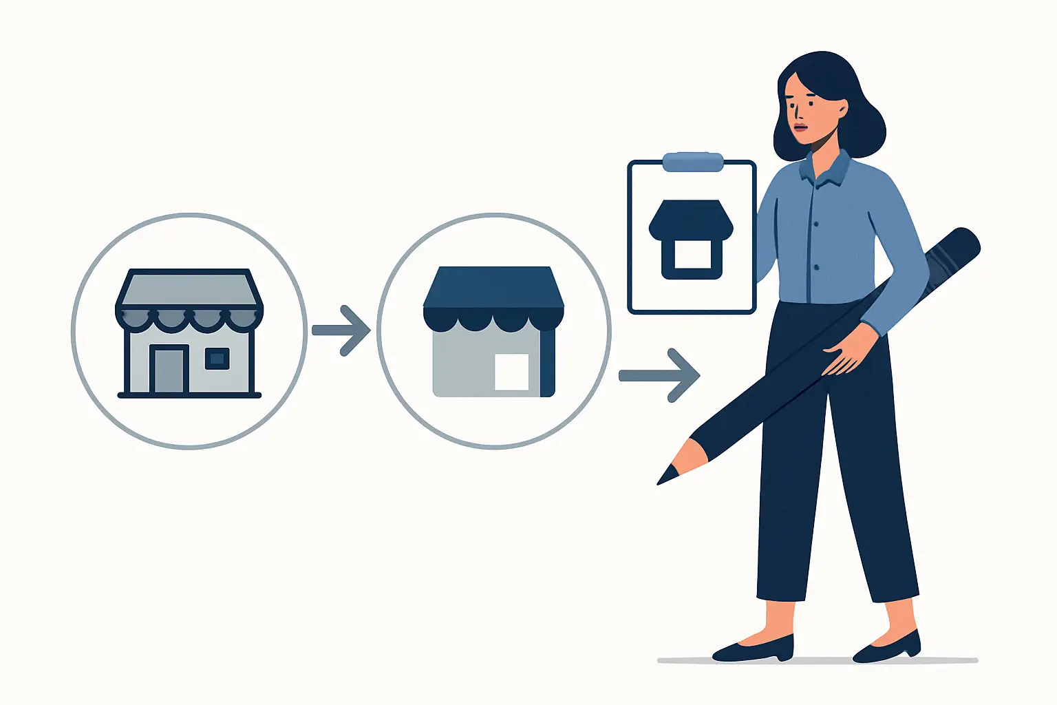
Below is a small business rebrand step by step process built for owners who want speed, clarity, and outcomes – not a drawn-out agency saga.
Step 1: Decide what kind of rebrand you actually need
Not every rebrand is a full reinvention. Most small businesses need one of three moves, and the right choice saves budget and prevents scope creep.
A refresh keeps your brand recognizable while improving clarity: cleaner logo execution, updated fonts and colors, tighter layouts, more consistent collateral. A refresh is ideal if your business name stays the same and customers already know you.
A reposition is deeper: the visuals change because your offer, audience, or pricing has changed. You might shift from “general contractor” to “high-end kitchen remodels,” or from “cafe” to “specialty coffee and catering.”
A rename is the biggest lift and the highest risk. It can be the right call if your current name limits growth, creates legal issues, or causes repeated confusion. It also impacts everything – signage, listings, email addresses, and referrals.
If you’re unsure, a fast gut-check is this: will your best customers still recognize you instantly after the change? If the answer is yes, you’re probably in refresh territory.
Step 2: Set the goal in plain numbers, not vibes
“Look more professional” is fine as a feeling, but it’s not a decision filter. You need one or two measurable outcomes so every creative choice has a purpose.
Common rebrand goals that work for small businesses include increasing quote requests, raising average order value, improving conversion from flyers, or making a premium price feel justified. If you’re in hospitality, it might be more bookings on slower nights. If you’re a local service provider, it might be fewer “just checking prices” leads and more serious inquiries.
This matters because a brand that’s built to feel premium will look different from one built for fast, high-volume promotions. Neither is wrong. The goal decides.
Step 3: Inventory every customer touchpoint before design starts
Most rebrands run over schedule because the business discovers “one more thing” every week. Get ahead of that by listing what customers actually see.
Think in three zones. First is daily-use: logo, business card, email signature, invoices, quotes, uniforms, vehicle decals. Second is marketing: flyers, social templates, promo signage, menus, door hangers, packaging, ads. Third is digital: website, Google Business profile images, booking pages, review request pages.
You’re not committing to redesigning everything at once. You’re simply mapping the landscape so your rollout is planned instead of reactive.
Step 4: Lock your positioning before you touch the logo
Design can’t rescue unclear messaging. Before you pick a font, get these decisions written down in a way your team can repeat.
Define your primary customer in one sentence. Define what you’re known for in one sentence. Then define the proof – what you do or deliver that backs it up. For example: “We help busy homeowners fix urgent plumbing issues fast, with upfront pricing and clean work.” That last part is the brand. Without it, you’ll end up with generic design that could belong to anyone.
If you serve multiple audiences, choose a primary one for your brand. You can still sell to others, but your visuals and messaging need a main target or they’ll land nowhere.
Step 5: Choose what stays so you don’t lose recognition
A rebrand is a change management project as much as it is a design project. Keeping one or two recognizable anchors helps repeat customers connect the dots.
Anchors can be your brand color family, a simplified version of your existing mark, a signature icon, or even your tone of voice. The point is continuity. If you change the name, logo, colors, and messaging all at once, you’re asking customers to relearn you from scratch.
There are times to go big, especially after a merger or a major shift in service. Just understand the trade-off: bigger change requires more communication and a tighter rollout.
Step 6: Build a tight creative brief that prevents revision spirals
The fastest rebrands are the ones with clear constraints. A good brief doesn’t limit creativity – it focuses it.
Your brief should include what you sell, who you sell it to, your price point relative to competitors, and the brand traits you want customers to feel (pick three, not ten). Add visual references if you have them, but be specific about what you like: “clean typography,” “high contrast,” “friendly but not playful.”
Also define deal-breakers. If you hate mascots, say it. If you never want script fonts, say it. Every “no” you clarify up front saves days later.
Step 7: Design the identity as a system, not a single logo
A logo is one asset. A brand is a working kit that holds up across print, web, and real life.
At minimum, your identity should include a primary logo, a simplified mark for small spaces, and a one-color version for stamps, embroidery, and low-cost printing. You also need a defined color palette with usable combinations, and typography rules that anyone can follow.
If your business relies on promotions, add layout rules for flyers and social graphics. If you’re appointment-based, make sure the branding supports clear calls-to-action and easy scanning.
This is where small businesses win by being practical: you don’t need a 60-page brand book. You need a system that stays consistent when you’re busy.
Step 8: Prioritize your first-wave deliverables
Trying to redo everything at once is how rebrands stall. Choose a first wave that impacts revenue and credibility immediately.
For many local businesses, the highest-ROI starting set is Logo + Business Card + Flyer because it covers referral moments, day-to-day credibility, and active promotion. That trio also forces your brand to work in different formats, which quickly exposes weak decisions.
If your business is primarily digital, swap the flyer for a website homepage refresh or a set of social ad templates. The best first wave is the one you will actually use in the next 30 days.
If you want a structured rollout with staged deliverables and clear revision checkpoints, a studio like Brandcrafter builds rebrands around modular “kits” so you can launch the essentials first and expand without redesigning from scratch.
Step 9: Run the rebrand like a project (timelines, approvals, files)
A rebrand feels stressful when there’s no process. Put simple guardrails in place.
Set a timeline with two or three review rounds max. More rounds do not equal better results – they usually mean the decision-maker is unclear. Choose one person who approves final designs. If multiple stakeholders must weigh in, collect feedback in one place and merge it into a single direction.
Also be specific about what you’re receiving at the end. Ask for print-ready PDFs, web-optimized PNGs, and editable source files if you’ll need future updates. Confirm color formats: CMYK for print, RGB for screens. This is the difference between “we have a logo” and “we can actually use our logo.”
Step 10: Update your real-world touchpoints before you announce
The easiest way to make a rebrand look messy is to announce it while your old branding is still everywhere. Customers then see two versions and assume the new one is temporary.
Start with the places people check for legitimacy: website header, Google Business images, social profile photos, and email signatures. Then update business cards, quotes/invoices, and any active promotional materials.
If you have signage or vehicle graphics, schedule them. You don’t need everything replaced on day one, but you do need a plan so the transition looks intentional.
Step 11: Tell customers what changed and why (keep it simple)
Most customers don’t care that you changed fonts. They care whether you’re the same business they trust, and whether the new look signals a better experience.
A good announcement is short: what’s changing, what’s staying the same, and what it means for them. If you’ve expanded services, improved your process, or upgraded your space, say so. If it’s just a refresh to match the quality you already deliver, that’s fine too.
If you’re changing your name, repeat it consistently for a while: “Formerly X, now Y.” Put it in your email signature, on your website, and in your social bio until confusion drops off.
Step 12: Measure the impact and tighten the system
A rebrand is not finished when the logo is final. It’s finished when it performs.
Track a few signals for 30 to 90 days: inquiries, conversion rate from flyer or ad campaigns, average sale, and the quality of leads. Also listen for language changes. If customers start repeating your new positioning back to you, the rebrand is landing.
You may find you need small adjustments: a higher-contrast color for readability, a simpler layout for faster flyer production, or a clearer headline on your website. That’s normal. The goal is a brand system that stays strong under real use, not a perfect concept file.
A rebrand should make your next marketing decision easier, not harder. If you can say “yes” or “no” faster to new promos, new packaging, and new campaigns because the rules are clear, you’ve done it right – and your customers will feel that confidence every time they see you.