You approve a logo concept on Monday. On Tuesday, you spot three more tweaks. By Thursday, your partner wants to “just try another color.” Suddenly the project feels stuck – not because anyone is difficult, but because nobody agreed on what a “revision round” actually is.
That’s why getting clear on design revision rounds meaning is more than a contract detail. It’s what keeps your timeline intact, your budget predictable, and your final design consistent across everything you use it on.
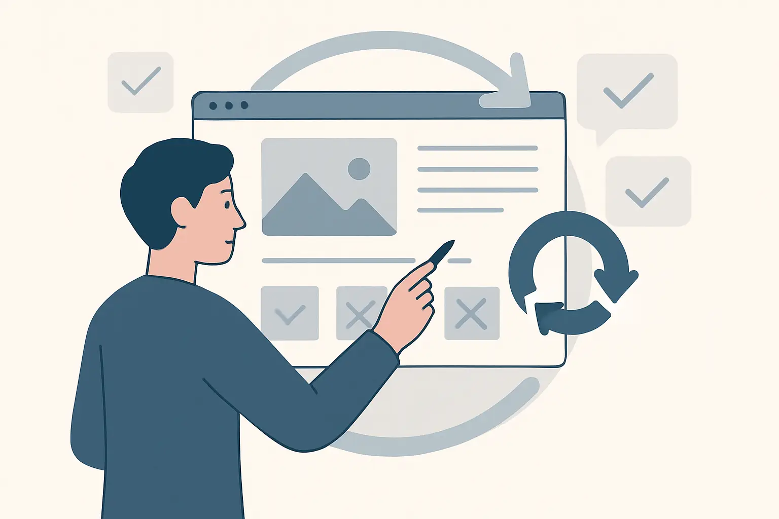
Design revision rounds meaning (in plain terms)
A revision round is a bundled set of changes you request after reviewing a delivered design milestone. You give your feedback in one pass, the designer applies it, and you receive an updated version for the next review.
Think of revision rounds like checkpoints, not unlimited edits. Each round is a structured cycle: deliver, review, revise, redeliver. The goal is forward motion.
Where clients get tripped up is assuming revisions are a real-time back-and-forth. That kind of ping-pong can work in casual situations, but it’s a risky way to run a brand project. It invites constant scope creep, delays production, and often leads to weaker decisions because nothing is ever “approved,” only “still in progress.”
A round also isn’t the same as a new direction. Adjusting a concept is a revision. Replacing the concept with a totally different approach is usually a new concept phase, and may require extra time or cost depending on the agreement.
What usually counts as a revision round
Most professional studios define a revision round as one consolidated feedback submission on the current version of the design.
If you send one email with clear notes like “Make the icon 10% larger, try the tagline in a lighter weight, and adjust the blue to feel less neon,” that’s a clean revision round. If you send five separate messages over two days, each adding new requests, that’s where projects slow down.
Revision rounds typically cover adjustments such as typography refinements, spacing, alignment, minor layout rebalancing, color tweaks, and small content edits. They’re meant to polish and finalize a direction you’ve already chosen.
For example, if you’re working on a business card and the layout is approved, a revision round might include shifting the hierarchy, tightening the margins for print safety, and updating a phone number. That’s normal.
What usually does NOT count as a revision round
This is where expectations need to be set early. Revision rounds aren’t designed to absorb major strategy changes or decisions that haven’t been made yet.
Common non-revision requests include switching to a new concept after approval, rewriting your business name or tagline, changing the brand’s target audience midstream, or introducing new deliverables that were never included (like adding a second flyer, social templates, or a full signage system).
Another gray area is “exploration.” Asking to see ten different font pairings “just to compare” is often concept exploration, not revision. Exploration can be valuable, but it should be scoped intentionally so you don’t burn time that should be spent refining the winning direction.
Also, if delays happen because you don’t have final content, photos, or product names yet, that’s not really a revision issue. It’s an input issue. The cleanest revision process depends on clean inputs.
Why structured revision rounds save you money and time
Revision limits can feel restrictive at first, but they actually protect the outcome.
They protect your timeline because design work is scheduled. When feedback comes in as an endless stream, the designer can’t plan production properly, and you end up waiting longer.
They protect your budget because a defined number of rounds is a defined amount of labor. Unlimited revisions sound client-friendly, but in practice they either inflate pricing for everyone or reduce the designer’s ability to be thoughtful and strategic.
They protect your brand consistency because tight checkpoints force alignment. You make decisions, approve them, and build on them. That’s how you end up with a logo that matches your card, which matches your flyer, which matches your website.
If you want a fast, collaborative process, revision rounds are the guardrails that make “fast” possible.
The real reason revisions blow up: misaligned decision-making
Most “too many revisions” situations aren’t caused by picky clients. They’re caused by unclear ownership.
If three stakeholders are giving separate opinions, you don’t have one round – you have three competing creative directors. The designer ends up mediating instead of designing.
If your team hasn’t agreed on basics like “modern vs. classic” or “premium vs. budget-friendly,” every draft becomes a debate. You’ll chase your tail across rounds because the target keeps moving.
And if your feedback is vague (“make it pop,” “I don’t love it,” “it feels off”), the designer has to guess. Guessing creates more versions, which creates more confusion, which creates more revisions.
Clear revision rounds aren’t just about design mechanics. They’re about decision structure.
How to use revision rounds effectively (without becoming a design expert)
You don’t need the right design vocabulary. You need the right format.
Start by choosing one decision-maker. That person can gather internal opinions, then send one consolidated set of notes. It keeps the project clean and avoids conflicting instructions.
Next, tie feedback to the goal. Instead of “Try a different font,” say “We want to feel more established and less playful – can you test a typeface with stronger, more traditional letterforms?” That gives the designer a direction, not a task list.
Then, prioritize. If you have ten notes, pick the two that matter most. Often, when the big issues are fixed (hierarchy, spacing, clarity), the smaller ones disappear.
Finally, keep each round bundled. One message. One document. One thread. This is the fastest way to respect the schedule on both sides.
A practical example: logo revisions vs. collateral revisions
Logo revisions are usually more sensitive because small changes can affect brand perception. A tiny shift in stroke weight, spacing, or icon geometry can move the logo from “premium” to “generic” fast.
Collateral revisions (like flyers and business cards) are often more straightforward: they’re about readability, hierarchy, and conversion. You might adjust the call to action, re-balance the layout to spotlight an offer, or swap imagery to better match the audience.
The key difference is that logos require more restraint. A logo that tries to satisfy every preference usually ends up weak. Collateral can handle more iteration because it’s message-driven and changes often.
If you treat logo rounds like a playground, you’ll burn them quickly. If you treat flyer rounds like strategy checkpoints, you’ll get marketing that performs.
What to ask your designer before you start
If you want no surprises, clarify the rules upfront. Ask how many revision rounds are included, what counts as a round, how feedback should be delivered, and what happens if you need additional rounds.
Also ask what stage approvals look like. Some studios treat “approval” as final for that element. Others allow minor tweaks later. Neither is automatically right, but you should know which system you’re working in.
If you’re working with a studio that packages brand assets and keeps everything consistent across deliverables, you’ll also want to confirm how revisions flow across the set. A change to your logo color can affect your business card, flyer, and web assets, so your revision structure should account for that reality.
At Brandcrafter, we use a structured, time-boxed revision workflow inside our 3P Method (Personal, Practical, Professional) because it keeps projects moving while protecting consistency across the full kit – not just one file.
When it makes sense to add more revision rounds
Sometimes more rounds are the smart choice.
If you’re rebranding a long-standing business, you may need extra internal alignment time. If multiple locations or partners are involved, one additional round can be cheaper than forcing a rushed decision you regret.
If you’re launching a new offer and the copy is still being finalized, a planned extra round can keep the design accurate without scrambling.
The trade-off is straightforward: more rounds can reduce risk, but they also extend timelines. The best approach is to add rounds intentionally, not by accident.
The fastest way to get a better design in fewer rounds
Give feedback that a designer can act on.
Instead of reacting to the design as “good” or “bad,” respond to what it’s doing. Is it clear at small sizes? Does it feel appropriate for your price point? Does the hierarchy guide the reader to the call to action? Does it look credible next to competitors?
When you speak in outcomes, the designer can make targeted choices. You’ll spend fewer rounds, and you’ll end up with a brand system you can actually use without second-guessing.
A helpful closing thought: if your revision process feels tense, don’t push harder on the design – tighten the decisions. The right structure makes the creative part easier for everyone.